CrossTabLayoutOptions.CornerHeaderDisplayMode Property
Specifies what data the Cross Tab should display in the top left corner.
Namespace: DevExpress.XtraReports.UI.CrossTab
Assembly: DevExpress.XtraReports.v20.2.dll
NuGet Packages: DevExpress.Reporting.Core, DevExpress.WindowsDesktop.Reporting.Core
Declaration
[DefaultValue(CornerHeaderDisplayMode.RowFieldNames)]
public virtual CornerHeaderDisplayMode CornerHeaderDisplayMode { get; set; }Property Value
| Type | Default | Description |
|---|---|---|
| CornerHeaderDisplayMode | RowFieldNames | The Cross Tab corner’s display mode. |
Property Paths
You can access this nested property as listed below:
| Object Type | Path to CornerHeaderDisplayMode |
|---|---|
| XRCrossTab |
|
Remarks
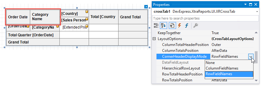
At design time, you can set the CornerHeaderDisplayMode property in the Cross Tab’s smart tag or in the Properties window’s LayoutOptions group.
This property provides the following values:
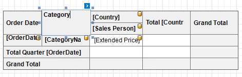
RowFieldNames (Default)
The top left corner is split into columns. The number of columns equals the number of row fields (the RowFields collection). Each cell displays the corresponding row field’s caption.
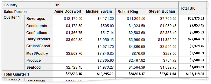
ColumnFieldNames
The top left corner is split into rows. The number of rows equals the number of column fields (the ColumnFields collection). Each cell displays the corresponding column field’s caption.
None
The top left cell spans multiple rows and columns and does not display text. The number of column and row fields (the ColumnFields and RowFields collections) defines the number of spanned rows and columns.
After you select the display mode, you can double-click a corner cell to invoke an in-place editor and type your custom text. You can specify the text in the None mode as well.