CheckBoxGlyphOptions.CustomGlyphs Property
Specifies a custom glyph image for each checkbox state.
Namespace: DevExpress.XtraReports.UI
Assembly: DevExpress.XtraReports.v19.1.dll
NuGet Packages: DevExpress.Reporting.Core, DevExpress.WindowsDesktop.Core
Declaration
Property Value
| Type | Description |
|---|---|
| CheckBoxGlyphs | Custom glyph images for each checkbox state |
Property Paths
You can access this nested property as listed below:
| Object Type | Path to CustomGlyphs |
|---|---|
| XRCheckBox |
|
Remarks
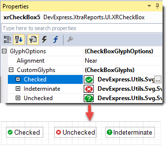
When there is no custom glyph image for a checkbox state, the control displays a glyph image specified by the Style property.
Design time
Visual Studio Report Designer
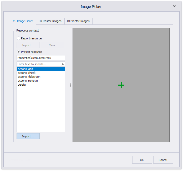
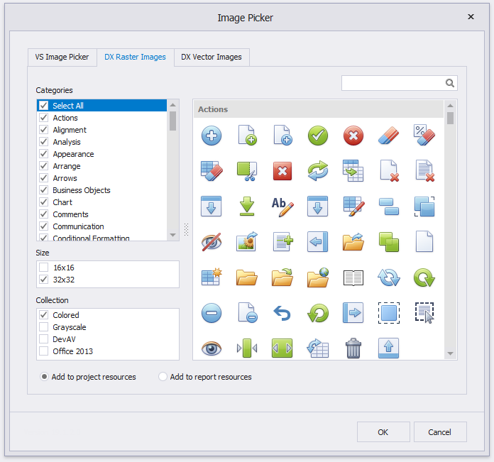
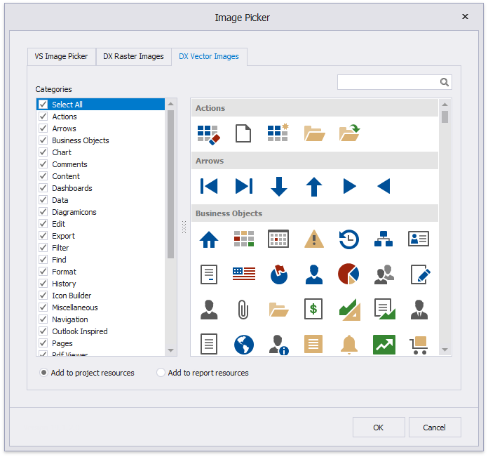
When you specify custom glyphs in Visual Studio at design time, the Image Picker is invoked. It allows you to set a custom glyph image or choose an glyph image from the DevExpress Image Library.
Visual Studio Image Chooser
DevExpress Raster Image Chooser
DevExpress Vector Image Chooser
You can choose whether to add the selected glyph image to the report or project resources. If you add the glyph image to project resources, you can reuse it in several reports.
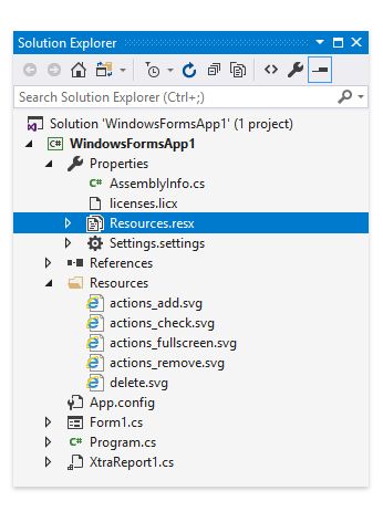
Project Resources
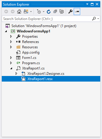
Report Resources
End-User Report Designer
When you specify custom glyphs in an End-User Report Designer, the Open File dialog is invoked.
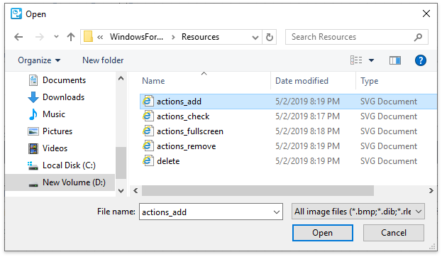
The selected glyph image is saved to the report definition .repx file.
Runtime
You can set glyphs for the following checkbox states:
Use the Item[CheckState] property to access the specified check state’s glyph image.
Example
The code sample below illustrates how to create a checkbox with custom glyphs.
using DevExpress.XtraReports.UI;
using DevExpress.XtraPrinting.Drawing;
// ...
public XRCheckBox CreateXRCheckBox() {
    // Create an XRCheckBox object.
    XRCheckBox xrCheckBox1 = new XRCheckBox();

    // Set the glyph size
    xrCheckBox1.GlyphOptions.Size = new SizeF(18, 18);
    // Set the glyph style
    xrCheckBox1.GlyphOptions.Style = DevExpress.XtraPrinting.GlyphStyle.Thumb;
    // Align the glyph to the right
    xrCheckBox1.GlyphOptions.Alignment = DevExpress.Utils.HorzAlignment.Far;

    // Add a glyph image for the Checked state
    xrCheckBox1.GlyphOptions.CustomGlyphs[CheckState.Checked] = ImageSource.FromFile(".\\checkbox-checked.svg");
    // Add a glyph image for the Unchecked state
    xrCheckBox1.GlyphOptions.CustomGlyphs[CheckState.Unchecked] = ImageSource.FromFile(".\\checkbox-unchecked.svg");
    // Add a glyph image for the Indeterminate state
    xrCheckBox1.GlyphOptions.CustomGlyphs[CheckState.Indeterminate] = ImageSource.FromFile(".\\checkbox-indeterminate.svg");

    return xrCheckBox1;
}