Add a Chart (Set Up Series Manually)
- 4 minutes to read
This document provides an example that demonstrates how to add a chart to a report, how to provide data for the chart series, and how to set up a chart’s elements.
Note
In this example, series data has a single data source. You can also use different data sources for different series.
Create a Reporting Application
Open an existing reporting application or create a new one from scratch to get started with this tutorial.
The report created in this tutorial is platform-agnostic. You can use it in any supported platform’s applications.
Add a Chart to the Report
Do the following to add a chart control to a report:
Drop the XRChart control from the DX.19.1: Report Controls Toolbox tab onto the Detail band.
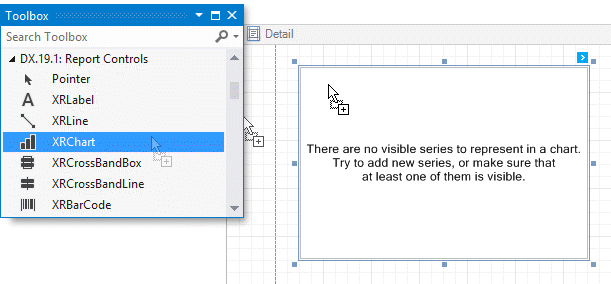
After you drop the chart, the Chart Wizard is automatically invoked if its “Display the designer every time a new chart is added” option is enabled. Close the wizard at this step.
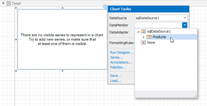
Click the chart’s smart tag to bind the chart to data. In the invoked action list, expand the drop-down list for the XRChart.DataSource property and click Add Report Data Source.
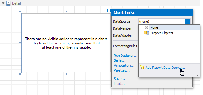
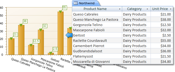
The invoked Data Source Wizard enables you to assign a data source to the chart. Bind the chart to the Northwind database’s Products table as described in the Bind a Report to a Database topic.
After the data source is created, it is assigned to the chart’s DataSource property.
Click the chart’s smart tag, open the drop-down list for the XRChart.DataMember property and select the Products item.
Note
When a report has its XtraReportBase.DataSource property specified, the Detail band is repeated in the Preview as many times as there are records in the report data source. Make sure that the DataSource property is set to None in your report if you do not want to repeat the chart on each report page.
Add Series to the Chart
Do the following to add a series to the chart and specify data binding properties:
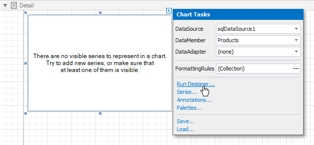
Click the chart’s smart tag and click Run Designer in the invoked action list.
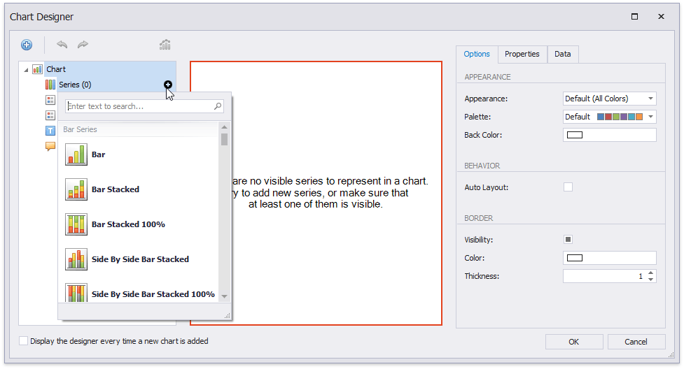
In the invoked Chart Wizard, follow the steps below to add a new series to the chart control.
- Locate the Series element in the chart elements tree and click the plus button.
- Select the type (for example, Bar) in the invoked series type list.
Populate the created series with points.
- Select the series in the tree and switch to the Data tab to the right of the designer’s window.
- Select an existing data source in the corresponding drop-down list.
- Drag-and-drop the data fields onto the Argument and Value cells to define series points’ coordinates.
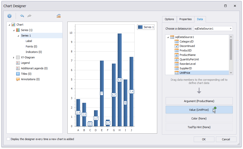
The Properties tab displays the Argument Data Member and Value Data Members settings that are automatically assigned to the corresponding fields.
Filter series data.
- Click the Data Filters property’s ellipsis button.
Create and adjust the filter criteria in the invoked dialog.
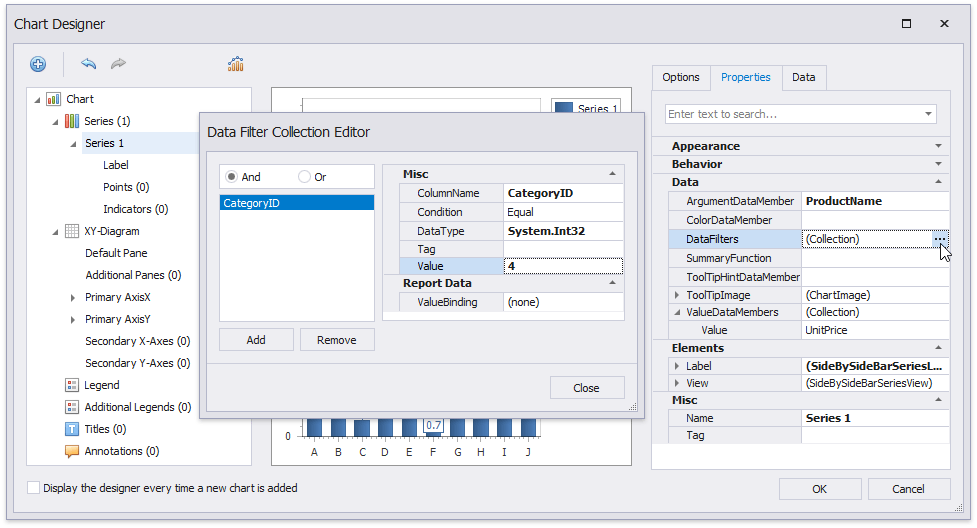
Click Close to save changes and close the dialog,
- Create another series with the same settings. Select the Point view type for this series.
Tip
Do the following to see how the chart looks when it is populated with data:
- save changes made in the Chart Designer;
- close the Chart Designer;
- switch to the report’s Preview.
Return to the Report Designer and invoke the Chart Designer. The chart axes are now populated with actual data and you can customize the chart.
Customize the Chart
Apply the following adjustments to improve the chart’s appearance:
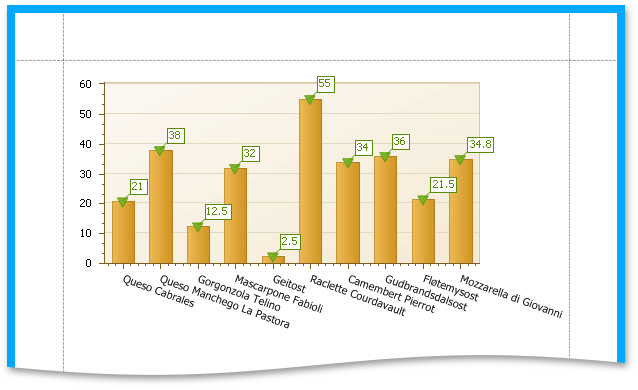
Remove the chart’s legend (the chart series are bound to the same data).
- Select Legend in the chart elements tree.
- Disable the Visibility check box in the Options tab.
Select the Label node under this series and disable the Visibility check box to hide Series1‘s point labels.
- Customize the Series2 markers’ appearance. Set the View.PointMarkerOptions.Kind property to InvertedTriangle and View.PointMarkerOptions.Size to 12 to replace the default circle with an upside down triangle.
- Customize the chart’s appearance settings. For instance, in the drop-down Palette list, select Nature Colors.
Preview and Publish the Report
Switch to the Preview tab to preview your report.