Balance Sheets
- 7 minutes to read
This tutorial describes how to use the XRCrossTab control to create a report similar to the Balance Sheet demo.
- View Online Demo.
- View Desktop Demo (requires the DevExpress Demo Center to be installed).
Tip
This tutorial demonstrates how to configure the Cross Tab control on the Design Surface. See Cross-Tab Reports for information on how to use the Cross-Tab Report Wizard.
Add a Demo Data Source
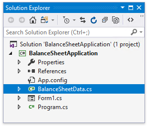
Copy the BalanceSheetData.cs/BalanceSheetData.vb file from the C:\Users\Public\Documents\DevExpress Demos 19.2\Components\Reporting\CS\DevExpress.DemoReports\BalanceSheetReport folder to your application. This file contains the BalanceSheetData class declaration.
Build your solution.
Add a Cross Tab and Bind It to Data
Invoke the Report Wizard and add a blank report to your application.
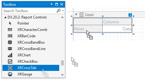
Drop the XRCrossTab control from the Toolbox onto the report’s Detail band.
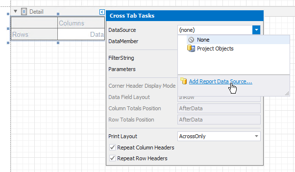
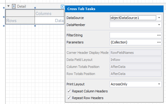
Click the Cross Tab’s smart tag, expand the DataSource property’s drop-down menu and click Add Report Data Source.
(4.1-4.5) Use the invoked Data Source Wizard to bind the Cross Tab to the BalanceSheetData class that you added above.
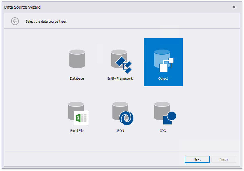
4.1. Select ‘Object’
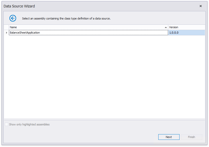
4.2. Select an assembly that contains a class to bind
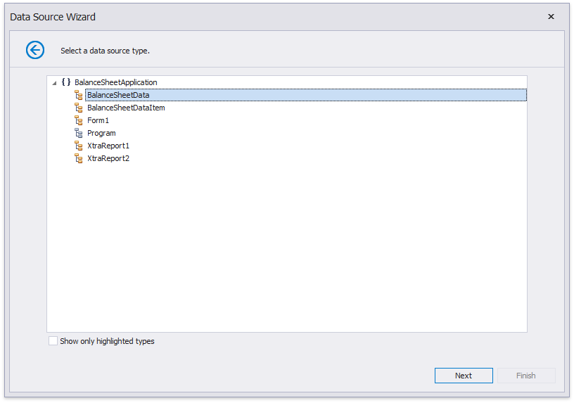
4.3. Select a class to bind
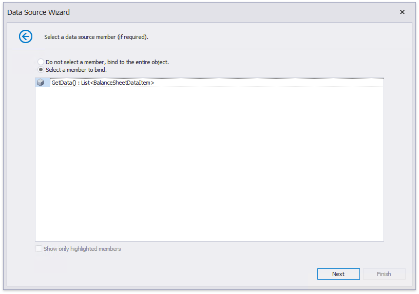
4.4. Select a member that provides data
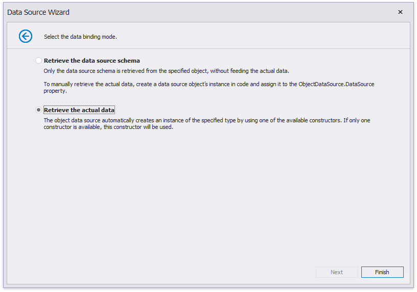
4.5. Retrieve the actual data
Click Finish to complete the Data Source Wizard and assign the created data source to the Cross Tab.
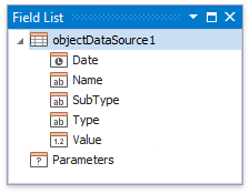
The data source structure becomes available in the Field List.
Note
Ensure that a report’s DataSource property is not set if you place the Cross Tab control in the Detail band. Otherwise, the Cross Tab data is printed as many times as there are rows in the report data source.
Define the Cross Tab Layout
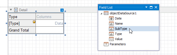
Drop the Type data field from the Field List onto the Cross Tab’s Rows area to display field values as row headers.
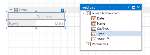
One Cross Tab cell becomes bound to this data field. The corresponding row is printed in the document as many times as there are field values in the data source. The cell in the top left corner displays the data field header.
One more row is added to the bottom of the Cross Tab to display grand total values calculated against this field.
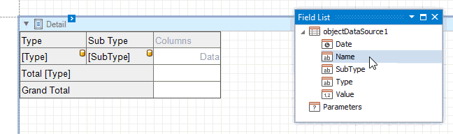
Drag the SubType data field from the Field List and drop onto the row area next to the cell bound to the Type field.
Since you locate the Type and SubType fields in the same row area, they form a hierarchy. The Type field values are displayed at the first hierarchy level (the first column). The SubType field values are grouped by the Type field values and displayed at the second hierarchy level (the second column). The top left corner displays headers for both data fields.
One more row is added to the Cross Tab to display total values calculated against the SubType field. The grand total values are calculated against all the rows.
Drag the Name data field from the Field List and drop onto the row area next to the cell bound to the SubType field.
The Name field values are displayed at the third hierarchical level. One more row is added to display totals against this field as well.
Drop the Date data field from the Field List onto the Columns area to display field values as column headers.
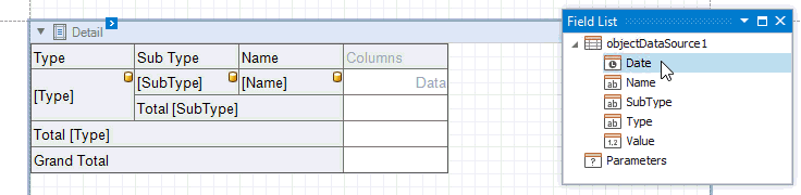
One Cross Tab cell becomes bound to this data field. One more column is added to the right of the Cross Tab to display grand total values calculated against this field.
Drop the Value data field from the Field List onto the Data area.
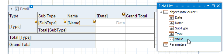
Data from this field is used to calculate summary values at the intersection of rows and columns. When the data area contains only one field, the field header is not displayed.
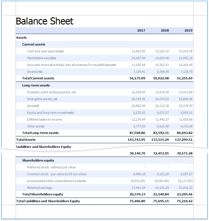
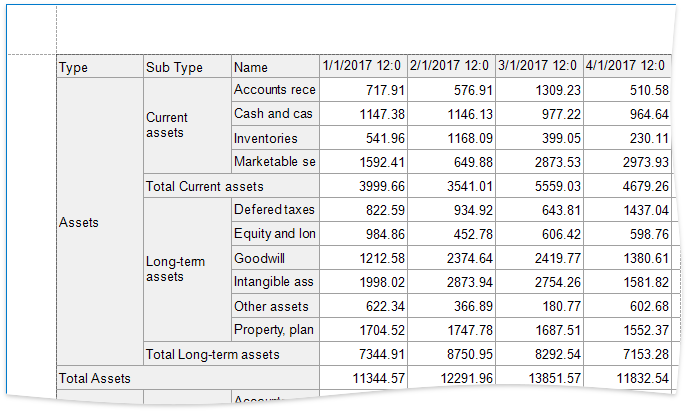
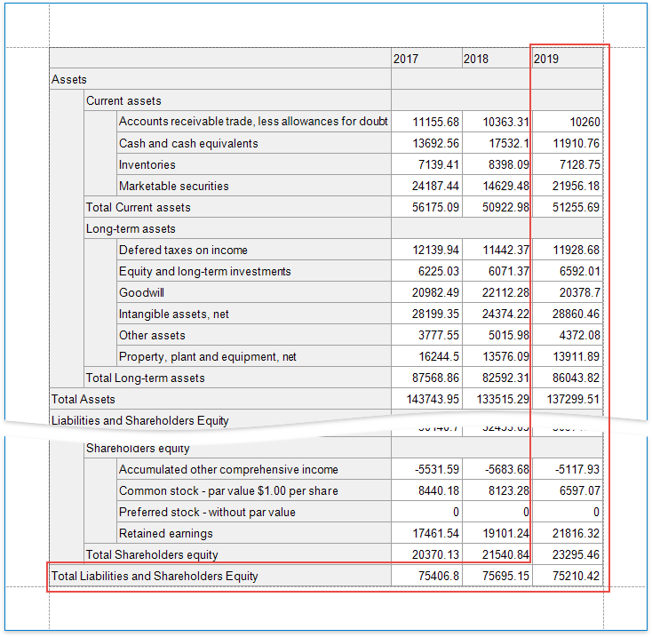
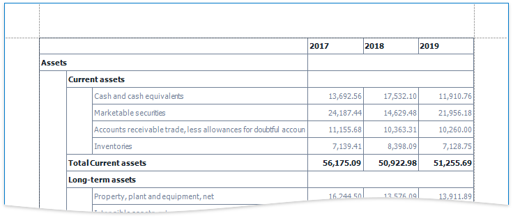
Switch to Print Preview to see the Cross Tab populated with data.
Specify Group Settings
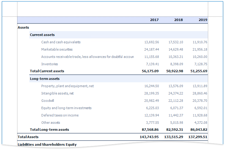
As you can see in the image above, the Cross Tab displays data for individual days.
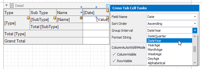
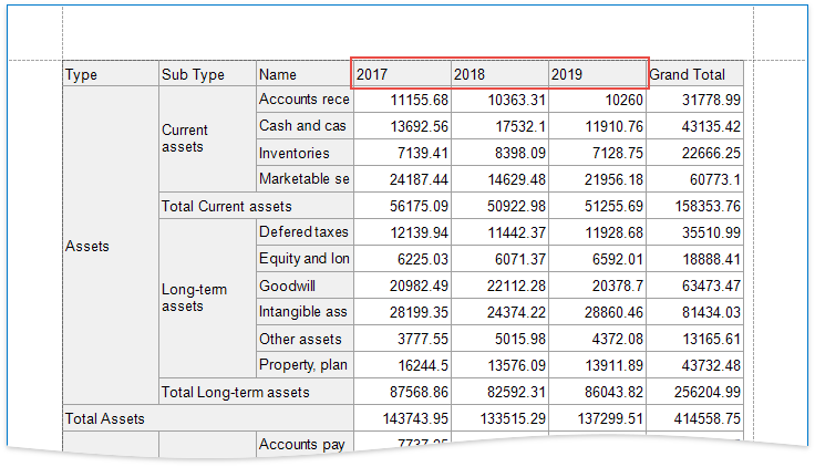
Select the Cross Tab cell bound to the Date field and click its smart tag. Set the GroupInterval property to DateYear to group the original data by years.
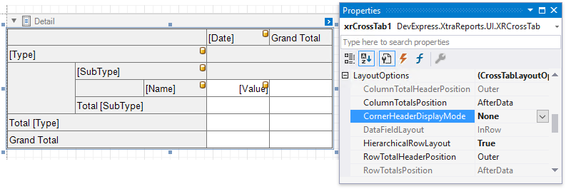
Specify Layout Options
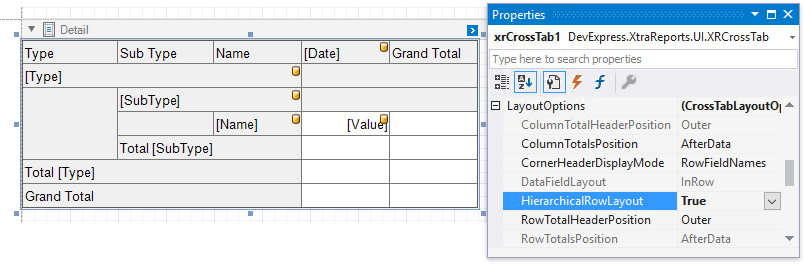
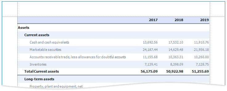
The Cross Tab arranges three row headers in a single line. You can display them in a tree-like form since they have a hierarchical structure.
Select the Cross Tab and switches to the Properties panel. Expand the LayoutOptions group and enable the HierarchicalRowLayout property.
Set the CornerHeaderDisplayMode property to None to merge cells in the top left corner and to not display any text.
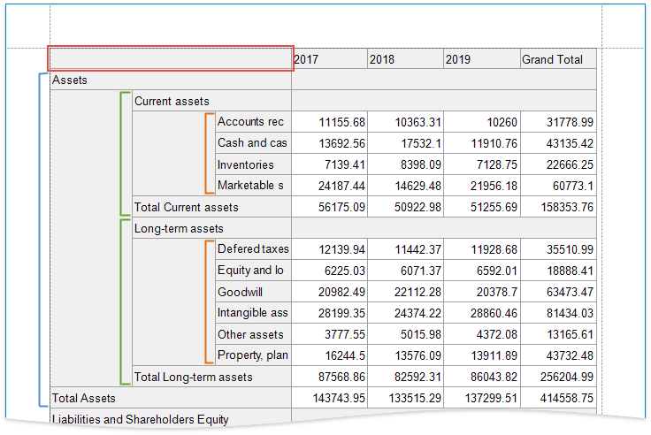
Switch to Print Preview to see the Cross Tab with tree-like rows and an empty top left corner.
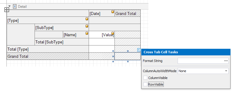
Hide Grand Totals
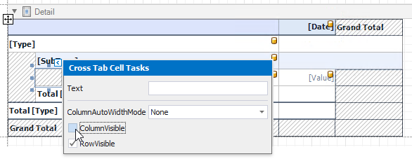
Select the bottom right cell and click its smart tag. Disable the RowVisible and ColumnVisible properties to hide the row and column that display grand total values. Invisible cells are filled with a hatch brush.
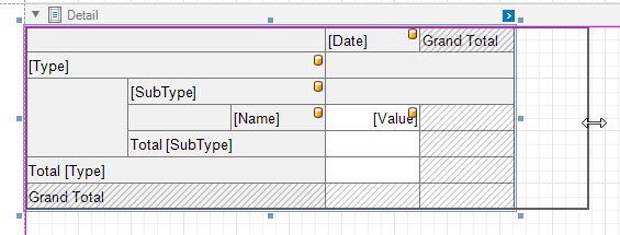
Drag the Cross Tab’s handlers to change its size. You can also adjust the size of individual rows and columns.
The Cross Tab control no longer displays grand total values.
Sort and Format Data
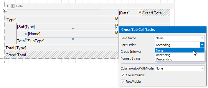
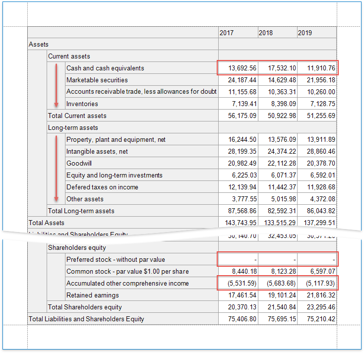
Select the cell bound to the Name field and change its sort order. The Cross Tab displays row and column field values in the ascending order. Set the SortOrder property to None to preserve the original order that comes from the data source.
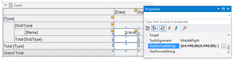
Format the currency data. Hold down SHIFT or CTRL and select the cells that display data and total values. Set the TextFormatString property to {0:#,##0.00;(#,##0.00);-}. This string consists of three formats separated by semicolons: for positive values, negative values and null values.
Customize Appearance
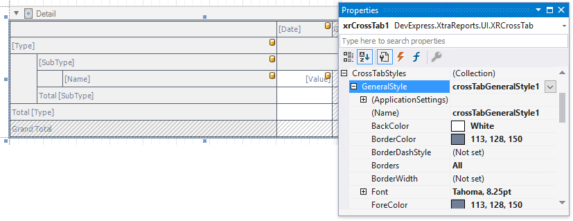
Select the Cross Tab, switch to the Properties window and expand the CrossTabStyles property. Use the GeneralStyle property to specify common appearance settings that apply to all Cross Tab cells. Set the following properties:
- BackColor to White
- BorderColor to 113, 128, 150
- Font to Tahoma, 8.25pt
- ForeColor to 113, 128, 150
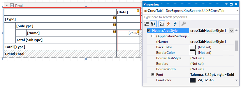
Expand the HeaderAreaStyle property and do the following:
- reset the BackColor property value to inherit the color from the general style;
- set the ForeColor property to 24, 32, 45 to override the general foreground color;
- set the Font property to Tahoma, 8.25pt, style=Bold to override the general font.
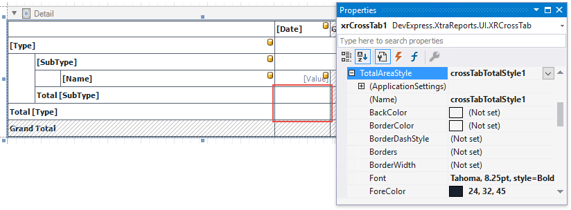
Expand the TotalAreaStyle property and set the following properties to override general settings:
- ForeColor to 24, 32, 45
- Font to Tahoma, 8.25pt, style=Bold
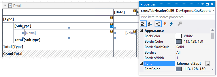
Select the cell bound to the Name data field and set the following appearance properties:
- ForeColor to 113, 128, 150
- Font to Tahoma, 8.25pt
These values apply to the selected cell only and override values specified for the entire header area.
Select the cells in the top row and in the rows with total values. Set the Borders property to Bottom and BorderWidth property to 2.
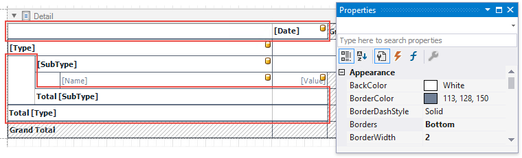
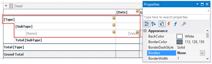
Select the cells you did not customize in the previous step and set the Borders property to None.
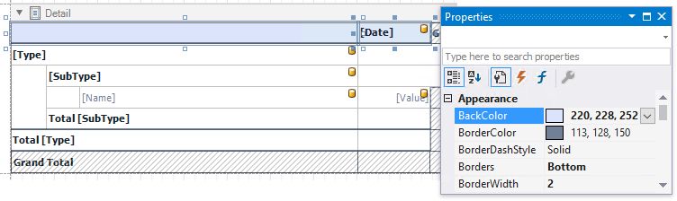
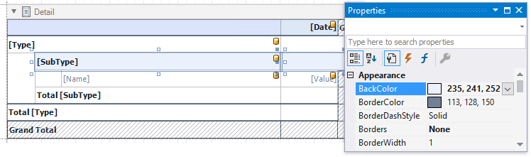
Select the cells in the top row and set the BackColor property to 220, 228, 252.
Select the cell bound to the SubType field and the next cell in the data area. Set their BackColor property to 235, 241, 252.
Apply Odd and Even Row Styles
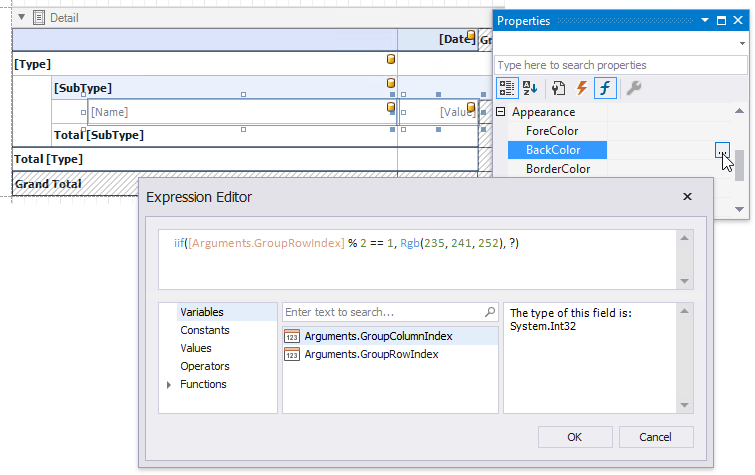
Use the GroupRowIndex variable in expressions to identify odd and even rows.
Select the cell bound to the Name field and the next cell in the data area. Go to the Properties window and open the Expressions tab. Click the BackColor property’s ellipsis button and specify the following expression:
iif([Arguments.GroupRowIndex] % 2 == 1, Rgb(235, 241, 252), ?)
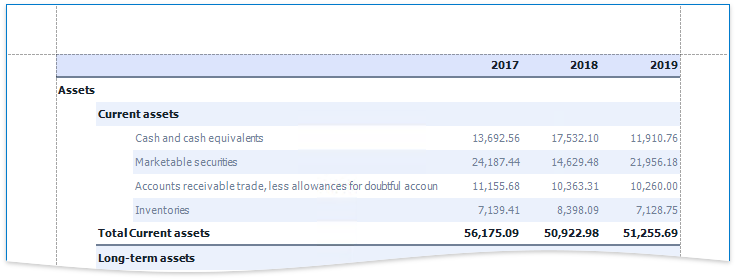
As you can see, the row backgrounds do not start from the left page border, but have indents. These indents correspond to auxiliary cells in a tree.
Select these auxiliary cells and disable the ColumnVisible property.
To add indents to row field values and imitate a tree-like view, set the Padding property of the following cells:
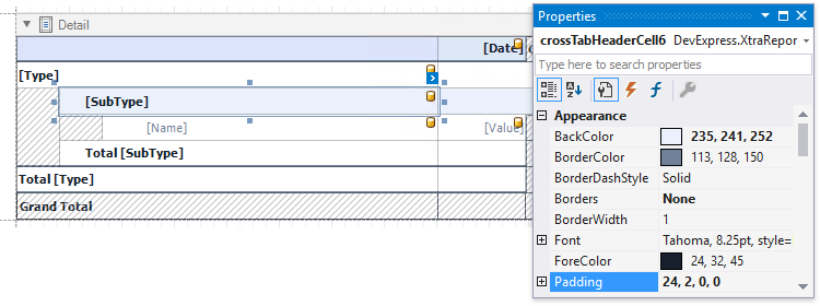
- the cell bound to the SubType field: 24, 2, 0, 0
- the cell bound to the Name field: 42, 2, 0, 0
- the cell that displays totals against the SubType field: 24, 2, 0, 0
Add a Report Title
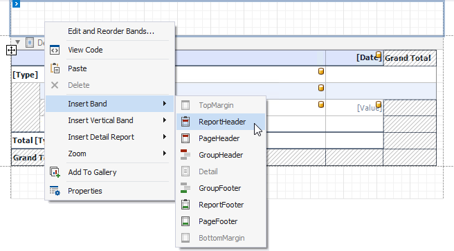
Right-click the report and select Insert Band / ReportHeader from the context menu.
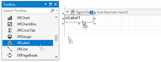
Drop the XRLabel control from the Toolbox onto the created Report Header.
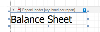
Double-click the label and type the report title. Specify appearance settings.
Switch to Print Preview to see the final result.