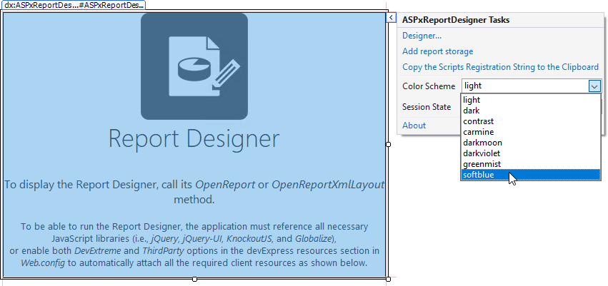
Customize the Report Designer Color Scheme
- 4 minutes to read
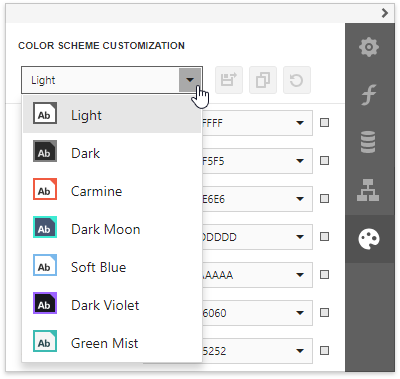
Choose a Predefined Color Scheme
The Web Report Designer provides predefined color schemes that specify the control’s appearance.
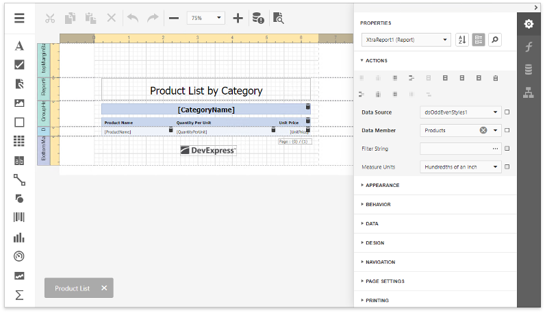
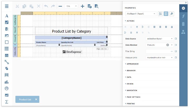
Light (Default)
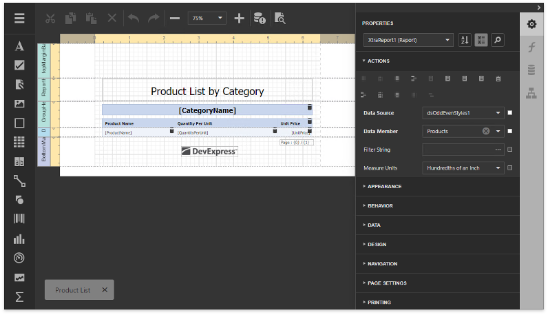
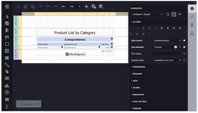
Dark
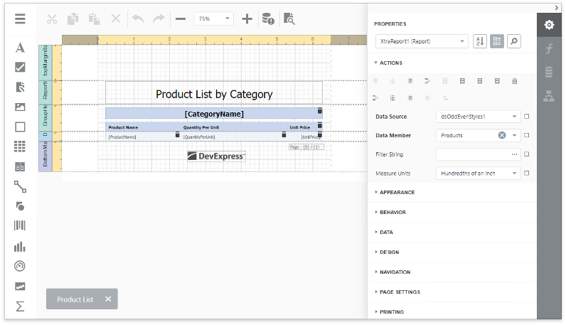
Carmine
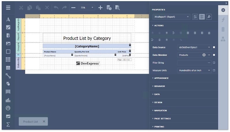
Dark Moon
Soft Blue
Dark Violet
Green Mist
Contrast
You can click the control’s smart tag and use its Color Scheme property to change the color scheme.
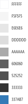
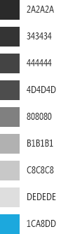
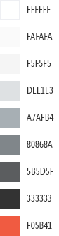
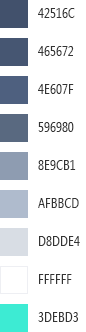
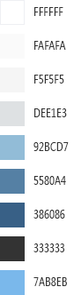
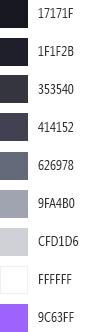
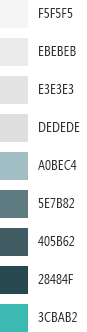
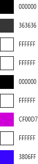
Each color scheme consists of nine colors. The following table illustrates the available palettes:
Light | Dark | Carmine | Dark Moon | Soft Blue | Dark Violet | Green Mist | Contrast | |
|---|---|---|---|---|---|---|---|---|
|
|
|
|
|
|
|
|
|

Create a Custom Color Scheme in the Demo
Tip
Online Example: How to create a custom color scheme for web reporting controls
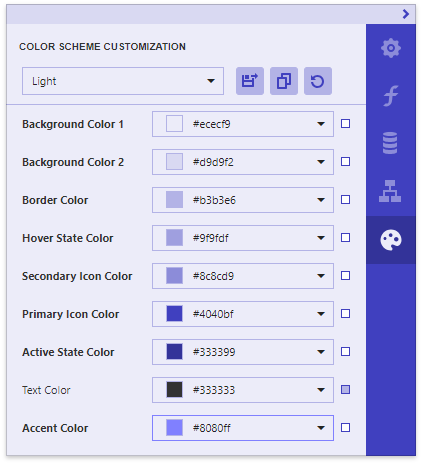
You can use the Color Scheme Customization online demo to create a color scheme based on a predefined color scheme.
In this demo, select a base color scheme from the Color Scheme Customization tab’s drop-down menu.
You can use the color picker or specify a color value to change a color. Changes are instantly applied to all the corresponding elements.
After you completed customization, click the Save Changes button to download a ZIP archive.
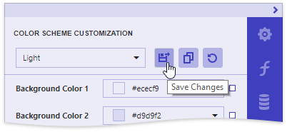
This archive has the {color_scheme}.customization.zip name, where {color_scheme} is the applied color scheme’s name (for instance, light.customization.zip).
The archive includes the following files:
reporting.{color_scheme}.custom.css (for instance, reporting.light.custom.css)
Contains changed styles that define the Report Designer’s common appearance.
devextreme.{color_scheme}.custom.css (for instance, devextreme.light.custom.css)
Contains changed styles for DevExtreme UI widgets used in the Report Designer.
dx.themebuilder.metadata.json
Contains metadata that you can use in the Theme Builder to customize DevExtreme widgets.
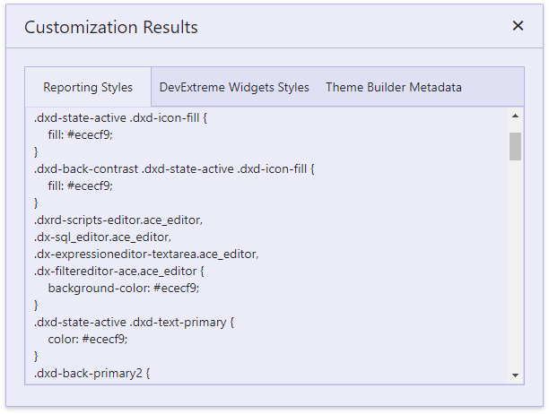
You can also click the View Changes  button to invoke the Customization Results dialog. This dialog’s tabs provide the same changed CSS classes and Theme Builder metadata.
The Reset Changes  button resets all the changes.
Once you saved the resulting files, you can apply the created color scheme to your Report Designer control:
Open an ASP.NET WebForms application that contains the Report Designer.
Apply the base color scheme to this control as described at the first document section.
Link the reporting and DevExtreme CSS files as shown below:
<asp:Content ID="Content" ContentPlaceHolderID="MainContent" runat="server">

    <link rel="stylesheet" href="devextreme.light.custom.css" type="text/css" />
    <link rel="stylesheet" href="reporting.light.custom.css" type="text/css" />

    <dx:ASPxReportDesigner ID="ASPxReportDesigner1" runat="server" ColorScheme="light" Height="800px" Width="900px" >
    </dx:ASPxReportDesigner>

</asp:Content>
Run the application to see the result.
Create a Custom Color Scheme Manually
You can customize the Report Designer’s CSS classes to create a custom color scheme.
1. Customize DevExtreme CSS Classes
Change the CSS classes for the Report Designer’s internal DevExtreme UI widgets.
Use the Theme Builder to change the colors and save the customization results (for instance, the generic.light.custom.css file for the light color scheme).
2. Customize Report Designer CSS Classes
The following tables list the classes that define the Report Designer’s common appearance grouped by categories. These classes correspond to colors in the base palettes.
Color | Background | Borders | |
|---|---|---|---|
1 | .dxd-back-primary2 .dxrd-navigation-panel-wrapper .dx-tab | ||
2 | .dxd-back-primary .dxd-back-highlighted:hover:not(.dxd-state-no-hover) .dxrd-navigation-panel-wrapper .dx-tab:hover | ||
3 | .dxd-back-secondary | .dxd-border-primary | |
4 | .dxd-back-highlighted.dxd-state-normal:hover:not(.dxd-state-no-hover) .dxd-back-highlighted.dxd-state-selected .dxd-back-highlighted.dxd-state-selected:hover | .dxd-border-secondary | |
5 | .dxd-back-highlighted.dxd-state-active .dxrd-navigation-panel-wrapper .dx-tab.dx-tab-selected .dxrd-navigation-panel-wrapper .dx-tab.dx-tab-selected:hover | .dxrd-navigation-panel-wrapper .dx-tab | |
6 | .dxd-back-contrast, .dxd-back-highlighted.dxd-state-active:hover:not(.dxd-state-no-hover) | ||
7 | .dxd-back-contrast .dxd-back-highlighted:hover .dxd-back-contrast .dxd-back-highlighted.dxd-state-active | ||
9 | .dxd-back-accented | .dxd-border-accented |
Color | Icons | Text | |
|---|---|---|---|
1 | .dxd-state-active .dxd-icon-fill .dxd-back-contrast .dxd-state-active .dxd-icon-fill | .dxd-state-active .dxd-text-primary .dxrd-navigation-panel-wrapper .dx-tab.dx-tab-selected .dxrd-navigation-panel-wrapper .dx-tab.dx-tab-selected .dx-icon | |
5 | .dxd-back-contrast .dxd-icon-fill | ||
6 | .dxd-icon-fill | ||
7 | .dxrd-navigation-panel-wrapper .dx-icon .dxd-text-info | ||
8 | .dxd-text-primary .dxrd-navigation-panel-wrapper .dx-tab | ||
9 | .dxd-text-accented |
The following code snippet demonstrates how to specify colors for each category (for instance, in the designer.light.custom.css file):
.dxd-back-primary {
    background-color: #d9d9f2;
}

.dxd-border-primary {
    border-color: #b3b3e6;
}

.dxd-icon-fill {
    fill: #4040bf;
}

.dxd-text-info {
    color: #333399;
}

// ...
You can also specify styles for individual Report Designer elements. Use a browser’s Developer Tools, locate the corresponding UI element in the page markup…
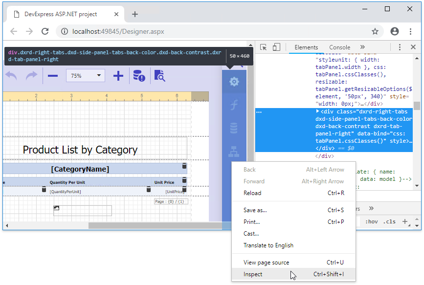
… and declare the assigned CSS class in your CSS file as follows:
// ...

.dxd-side-panel-tabs-back-color {
    background-color: #333399;
}
3. Apply CSS files to your Report Designer
Open the web page that contains the Report Designer control and link the DevExtreme (generic.light.custom.css) and Report Designer (designer.light.custom.css) CSS files as shown below:
<asp:Content ID="Content" ContentPlaceHolderID="MainContent" runat="server">

    <link rel="stylesheet" href="generic.light.custom.css" type="text/css" />
    <link rel="stylesheet" href="designer.light.custom.css" type="text/css" />

    <dx:ASPxReportDesigner ID="ASPxReportDesigner1" runat="server" ColorScheme="light" Height="800px" Width="900px" >
    </dx:ASPxReportDesigner>

</asp:Content>