Create Custom Controls
- 5 minutes to read
This document describes how to create custom controls and use them in your reports.
Implementing Custom Controls
You can expand the default report control set or override them by creating your custom controls.
Deriving your control from an existing report control
This enables you to modify the existing control’s functionality by overriding some of its properties, methods and events, or adding new custom members to it.
Tip
The following tutorial describes how to customize the XRLabel control by adding a new Number property to it, making this control accept and display only numeric values: Create a Custom Numeric Label.
Deriving your control from the base XRControl class
This enables you to fully customize the control’s behavior, and create a custom control with any functionality. Typically, you need to override the following two methods when deriving from the XRControl class:
CreateBrick
This protected method returns a VisualBrick containing the control’s data. This method is called every time an XtraReport generates a report’s Document (for example, when calling the XtraReport.CreateDocument or PrintTool.ShowPreview method).
PutStateToBrick
This protected method is called for each brick the CreateBrick method creates to get a visual representation of this custom control when a report document is being generated. For example, when a custom report control is placed onto the detail report band, the PutStateToBrick method is called every time the detail report band is rendered for each data row. You can use this method to modify a custom control’s layout and appearance when the control’s properties are changed for each detail row.
Tip
See Create a Custom Progress Bar Control for a detailed tutorial on creating a custom control.
The following example illustrates the implementation of more complex report controls:
Declaring Custom Controls
You can declare a custom control’s class in one of the following ways:
In the main application assembly.
In this case, the design-time preview in Visual Studio is not supported.
In a separate assembly (such as an assembly storing all custom controls for your application).
This approach provides the following advantages:
- The custom controls are correctly rendered when previewing a report at design time within Visual Studio.
- You can reuse the custom controls in other applications (there is no need to copy and modify the same code in multiple projects).
In this case, you need to either register this DLL in the GAC (To learn more, see the Global Assembly Cache and Strong-Named Assemblies topics in MSDN), or to place this assembly in a specific location on a disk and then add it to the References list of your project.
Note
You should declare your custom report control as a public class; otherwise, it does not operate correctly in many common scenarios such as report serialization. In particular, it is impossible to copy and paste non-public report controls in the Report Designer.
Adding Custom Controls to the Toolbox
Adding Custom Controls to the Visual Studio Toolbox (Design Time)
Do the following to add a custom control to the Visual Studio toolbox and use this control at design time:
- Switch to the toolbox, expand the DX.19.1: Reporting tab and right-click the toolbox.
- Select the Choose items menu item, which invokes the Choose Toolbox Items dialog.
- Click Browse and specify the path to the assembly file containing the custom control. Select the custom control and click OK.
Adding Custom Controls to the End-User Report Designer Toolbox (Runtime)
See the following tutorials to learn how to add a custom control to an End-User Report Designer’s toolbox in different application platforms:
- Add Controls to an End-User Report Designer’s Toolbox (WinForms applications)
- Add a Custom Control to the Report Designer Toolbox (WPF applications)
- Register a Custom Control in the Report Designer Toolbox (Web applications)
The following attributes register a control in the End-User Report Designer toolbox:
- ToolboxBitmapAttribute - use this attribute to identify the Report Explorer‘s control icon.
- ToolboxBitmap24Attribute - use this attribute to identify the control’s icon for a standard Report Designer’s toolbox.
- ToolboxBitmap32Attribute - use this attribute to identify the control’s icon for a ribbon-based Report Designer’s toolbox.
Latest DevExpress Reporting versions provide the ToolboxSvgImage attribute as well, for specifying a single vector SVG image for use in both the toolbox and in the Report Explorer.
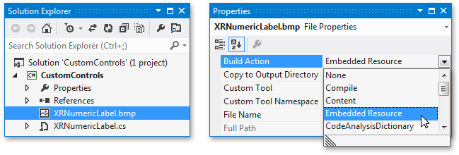
Tip
The image file’s name must match the control’s class name, and your project’s Build Action property must be set to Embedded Resource.
See How to create a custom control and register it in the End-User Report Designer toolbox with a custom icon to learn more.
Specifying the Default Property for Data Binding
Each data-aware report control must have a default property used for binding this control to data. For the XRControl class, this is the XRControl.Tag property. Use the DefaultBindableProperty attribute to specify another property for your custom control:
using DevExpress.XtraReports;
using DevExpress.XtraReports.UI;
// ...

// Set the default bindable property.
[DefaultBindableProperty("MyProperty")]
public class MyControl : XRControl  {
   // ...

   // Make the MyProperty bindable.
   [DefaultValue(0), Bindable(true)]
   public int MyProperty {
      // ...
   }

   // ...
}