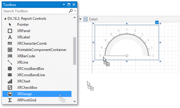
Add Gauges to a Report
- 2 minutes to read
This topic explains XRGauge control basics and describes its main features.
Gauge Overview
The XRGauge control provides you with the capability to embed graphical gauges into your report.
To add this control to the report, drag the XRGauge item from the DX:18.2: Report Controls Toolbox tab and drop it onto the report.
The following properties determine XRGauge appearance.
View Type
Specifies the type of the displayed gauge. Each view type supports different View Styles. The following XRGauge view types are available.
Circular
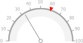
Supports view styles: Full, Half, Quarter Left, Quarter Right and Three Fourth.
Linear
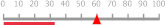
Supports view styles: Horizontal and Vertical.
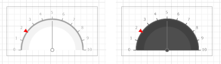
View Theme
Specifies the color theme of the displayed gauge. The FlatLight and FlatDark view themes are supported.
The following properties allow you to customize the gauge scale and specify its displayed values.
Actual Value
Specifies the value displayed by a gauge.
Target Value
Specifies the position of the target value marker.
Maximum
Specifies the gauge’s maximum value.
Minimum
Specifies the gauge’s minimum value.
These properties can be bound to a numeric data field obtained from the report’s data source.
Bind a Gauge to Data
To bind the displayed value of an XRGauge to data, click the control’s smart tag and in the invoked actions list, expand the Expression drop-down list for the ActualValue property and select the required data field.
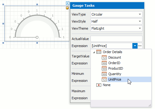
In the same way, you can bind the Target Value, Minimum and Maximum properties to data. To do this, expand the Expression drop-down list for corresponding property and select the required data field.
Clicking the Expression option’s ellipsis button invokes the Expression Editor, in which you can construct a complex binding expression involving two or more data fields.
See the Bind Report Controls to Data topic to learn more about available data binding modes and creating data-aware controls.