Implement a Custom Control from Scratch
- 9 minutes to read
Do the following to implement a custom control from scratch:
- Create a new class for a custom control and derive it from the base XRControl class.
- Implement properties, methods, events, and other members for the custom control class.
- Override methods that create bricks from a custom control.
Create Bricks from a Custom Control
Bricks are basic elements of a report’s document. When you open Preview or change the report layout in Designer, the report controls are transformed into bricks and the bricks are then shown in Preview / Designer.
When you implement a custom control from scratch, override the XRControl’s CreateBrick, PutStateToBrick, and GetStateFromBrick (optional) methods to create bricks from the custom control.
CreateBrick
protected override VisualBrick CreateBrick(VisualBrick[] childrenBricks) {
    return new VisualBrick(this);
}
Use this method to create and return a new brick. Refer to the following article for information on different brick types: Classes Hierarchy: Bricks.
If a control contains other controls, the application creates bricks for those controls before it calls the CreateBrick method for the initial control. Use the childrenBricks array to access the bricks of the contained controls.
PutStateToBrick
protected override void PutStateToBrick(VisualBrick brick, PrintingSystemBase ps) {
    base.PutStateToBrick(brick, ps);

    // Set up the brick's properties.
    // ...
}
The method takes a brick created in the CreateBrick method as the first argument. Use this method to set up the brick’s properties.
GetStateFromBrick (Optional)
protected override void GetStateFromBrick(VisualBrick brick) {
    base.GetStateFromBrick(brick);

    // Copy the current brick state to the control.
    // ...
}
The method takes a brick modified in the PutStateToBrick method as an argument. Use this method to copy the current brick state to the control before you access the control’s properties in the PrintOnPage event.
Example: Create a Custom Progress Bar Control
The example below shows how to implement a custom progress bar control from scratch. The example also demonstrates how to bind the control to data and use the control to display the countries’ areas.
Get Started
Create a new Visual Studio project named CustomProgressBar. Then, add a blank report to the project.
Extend the XRControl Base Class
- Add a new ProgressBar.cs file to the project.
- Create the ProgressBar class and derive it from the XRControl base class.
- Implement a new Position property to store the current bar position and a new MaxValue property to store the maximum value of the bar position.
- Implement methods that create bricks from the progress bar control.
using DevExpress.XtraReports;
using DevExpress.XtraReports.UI;
using System.ComponentModel;
using System.Drawing;
using DevExpress.XtraReports.Localization;
using DevExpress.Utils.Serializing;

namespace CustomProgressBar {
    public class ProgressBar : XRControl {
        private float position = 0;
        private float maxValue = 100;

        public ProgressBar() {
            this.ForeColor = SystemColors.Highlight;
        }

        [DefaultValue(100)]
        [Description("The maximum value of the bar position.")]
        [DisplayName("Max Value")]
        [Category("Parameters")]
        [XtraSerializableProperty]
        public float MaxValue {
            get { return this.maxValue; }
            set {
                if (value <= 0) return;
                this.maxValue = value;
            }
        }

        [DefaultValue(0)]
        [Description("The current bar position.")]
        [DisplayName("Position")]
        [Category("Parameters")]
        [XtraSerializableProperty]
        public float Position {
            get { return this.position; }
            set {
                if (value < 0 || value > maxValue)
                    return;
                this.position = value;
            }
        }

        /*
            You can use two bricks to construct a progress bar. The "VisualBrick"
            corresponds to a rectangle bar, the "PanelBrick" serves as a container
            for this bar.
        */

        protected override VisualBrick CreateBrick(VisualBrick[] childrenBricks) {
            // Create and return a panel brick.
            return new PanelBrick(this);
        }

        protected override void PutStateToBrick(VisualBrick brick, PrintingSystemBase ps) {
            base.PutStateToBrick(brick, ps);

            // Cast the "brick" variable to the "PanelBrick" type (the type of the brick
            // created in the "CreateBrick" method).
            PanelBrick panel = (PanelBrick)brick;

            // Create a new visual brick to display a bar.
            VisualBrick progressBar = new VisualBrick(this);

            // Hide the brick's borders.
            progressBar.Sides = BorderSide.None;

            // Set the foreground color for the bar.
            progressBar.BackColor = panel.Style.ForeColor;

            // Calculate the width of the progress bar's filled area.
            float filledAreaWidth = panel.Rect.Width * (Position / MaxValue);

            // Create a rectangle to be filled by the foreground color.
            progressBar.Rect = new RectangleF(0, 0, filledAreaWidth, panel.Rect.Height);

            // Add the visual brick to the panel brick.
            panel.Bricks.Add(progressBar);
        }
    }
}
Tip
Apply the XtraSerializableProperty attribute for custom properties to serialize these properties when you save a report in the XML format. Refer to the following topic for details on control serialization: Store Report Layouts.
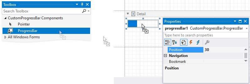
Add the Progress Bar to the Visual Studio Toolbox
Set the ToolboxItem attribute for the ProgressBar class to true:
namespace CustomProgressBar {
    [ToolboxItem(true)]
    public class ProgressBar : XRControl {
        //...
    }
}
Build the solution. The ProgressBar control appears in the toolbox and you can drop the control onto the report’s bands.
Specify the Default Property for Data Binding
Apply the DefaultBindableProperty attribute to the Position property. When you drop a field from the Field List onto the control, the Position property is bound to this field.
using DevExpress.XtraReports;

namespace CustomProgressBar {
    [DefaultBindableProperty("Position")]
    public class ProgressBar : XRControl {
        //...
    }
}
Add the Position Property to the Property Grid’s Expressions Tab
Implement a static constructor for the ProgressBar class as shown below to add the Position property to the Property grid‘s Expressions tab:
using DevExpress.XtraReports.Expressions;

namespace CustomProgressBar {
    public class ProgressBar : XRControl {
        static ProgressBar() {
            // Specify an array of events in which the property should be available.
            string[] eventNames = new string[] { "BeforePrint" };

            // Specify the property position in the property grid's "Expressions" tab.
            // 0 - first, 1000 - last.
            int position = 0;

            // Specify an array of the property's inner properties.
            string[] nestedBindableProperties = null;

            // Specify the property's category in the property grid's "Expressions" tab.
            // The empty string corresponds to the root category.
            string scopeName = "";

            // Create and set a description for the "Position" property.
            ExpressionBindingDescription description = new ExpressionBindingDescription(
                eventNames, position, nestedBindableProperties, scopeName
            );

            ExpressionBindingDescriptor.SetPropertyDescription(
                typeof(ProgressBar), nameof(Position), description
            );
        }
    }
}
Rebuild the solution. The Position property appears in the Property grid‘s Expressions tab.
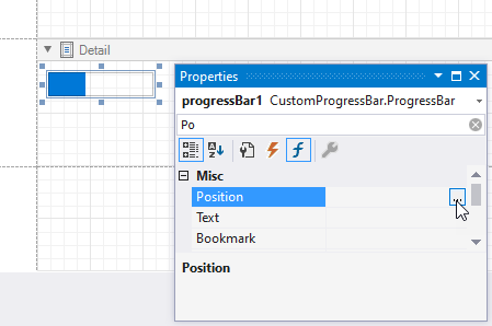
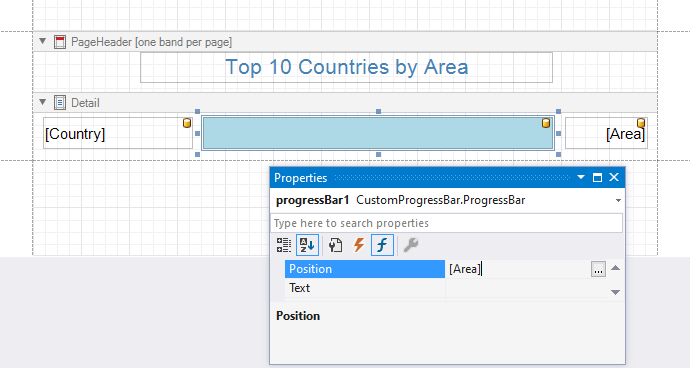
Click the property’s ellipsis button and use the invoked Expression Editor to specify an expression.
Use the Progress Bar Control
Follow the steps below to bind the progress bar control to a data source that contains information about countries and their areas.
Bind the report to the following JSON data source.
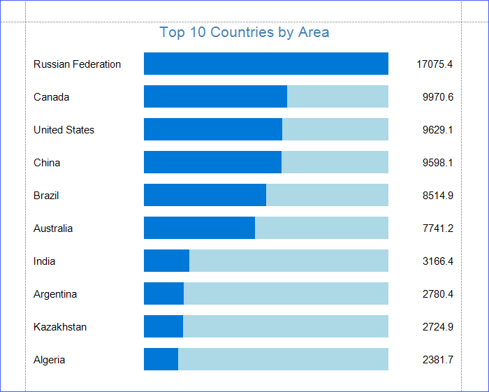
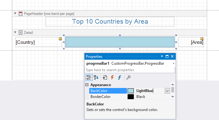
Expand[ { "Country": "Russian Federation", "Area": 17075.4 }, { "Country": "Canada", "Area": 9970.6 }, { "Country": "United States", "Area": 9629.1 }, { "Country": "China", "Area": 9598.1 }, { "Country": "Brazil", "Area": 8514.9 }, { "Country": "Australia", "Area": 7741.2 }, { "Country": "India", "Area": 3166.4 }, { "Country": "Argentina", "Area": 2780.4 }, { "Country": "Kazakhstan", "Area": 2724.9 }, { "Country": "Algeria", "Area": 2381.7 } ]Design the report layout as shown below. Use the XRLabel control to display countries’ titles and areas. Set the ProgressBar control’s BackColor property to LightBlue and MaxValue property to 17100.
In the Property grid‘s Expressions tab, bind the progress bar’s Position property to the Area data field.
Switch to Preview to show the final result.