Create a Custom Progress Bar Control
- 7 minutes to read
This tutorial provides an example of how to create a custom report control (the progress bar), and describes how to use this control in an XtraReport.
Tip
Online Example: How to create custom report controls
Create a ProgressBar Control
In this example, the progress bar control is implemented as a filled rectangle with variable width, and serves as a graphical representation of a numerical value. This custom control has two primary properties - Position and MaxValue. The Position property determines the current progress for the value tracked by this control (how much of the bar is> filled in with the progress color). The MaxValue property determines the maximum value for the Position property. Therefore, it determines the scale used by the progress bar. Note that the Position property is bindable, which allows the progress bar control to be used in data-aware reports.
To create a progress bar control, do the following:
- Create a new Class Library project. To do this, start Microsoft Visual Studio 2010, 2012, 2013, 2015 or 2017 and select File | New | Project… in the main menu. Then, in the invoked New Project dialog, select the template for Class Library, specify CustomControls as the name of the new project and click OK.
- Change the name of the newly added class from Class1 to ProgressBar.
- Add the System.Drawing, DevExpress.Data.v18.2, DevExpress.Utils.v18.2, DevExpress.XtraPrinting.v18.2 and DevExpress.XtraReports.v18.2 assemblies to the References list of your project.
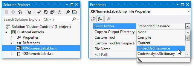
To define a custom control icon, displayed in the Toolbox and Report Explorer, create a custom bitmap file (24x24 pixels) and add it to the project.
When adding an image file to the project, please make certain that its name matches the class name, and the Build Action property is set to Embedded Resource.
The following code demonstrates how to inherit the ProgressBar class from the base XRControl class, introduce the Position and MaxValue properties, and override a few protected methods of the base XRControl class, to implement all required functionality for the progress bar control.
using System.ComponentModel; using System.Drawing; using DevExpress.Utils.Design; using DevExpress.XtraPrinting; using DevExpress.XtraReports; using DevExpress.XtraReports.UI; // ... namespace WindowsFormsApplication1 { // The DefaultBindableProperty attribute is intended to make the Position // property bindable when an item is dropped from the Field List. [ ToolboxItem(true), DefaultBindableProperty("Position"), ToolboxBitmap24Attribute(@"WindowsFormsApplication1.ProgressBar24x24.png, WindowsFormsApplication11") ] public class ProgressBar : XRControl { // The current position value. private float pos = 0; // The maximum value for the progress bar position. private float maxVal = 100; public ProgressBar() { this.ForeColor = SystemColors.Highlight; } // Define the MaxValue property. [DefaultValue(100)] public float MaxValue { get { return this.maxVal; } set { if (value <= 0) return; this.maxVal = value; } } // Define the Position property. [DefaultValue(0), Bindable(true)] public float Position { get { return this.pos; } set { if (value < 0 || value > maxVal) return; this.pos = value; } } // Override the XRControl.CreateBrick method. protected override VisualBrick CreateBrick(VisualBrick[] childrenBricks) { // Use this code to make the progress bar control // always represented as a Panel brick. return new PanelBrick(this); } // Override the XRControl.PutStateToBrick method. protected override void PutStateToBrick(VisualBrick brick, PrintingSystemBase ps) { // Call the PutStateToBrick method of the base class. base.PutStateToBrick(brick, ps); // Get the Panel brick which represents the current progress bar control. PanelBrick panel = (PanelBrick)brick; // Create a new VisualBrick to be inserted into the panel brick. VisualBrick progressBar = new VisualBrick(this); // Hide borders. progressBar.Sides = BorderSide.None; // Set the foreground color to fill the completed area of a progress bar. progressBar.BackColor = panel.Style.ForeColor; // Calculate the rectangle to be filled by the foreground color. progressBar.Rect = new RectangleF(0, 0, panel.Rect.Width * (Position / MaxValue), panel.Rect.Height); // Add the VisualBrick to the panel. panel.Bricks.Add(progressBar); } } }- Rebuild the project. After building the solution, an assembly containing the ProgressBar control will appear in the \Bin\Debug directory of the project.
Add the ProgressBar Control to a Report
The following example demonstrates how the ProgressBar control can be used in a real-world application. Follow the steps below.
- Create a new Windows Forms Application using Visual Studio 2010, 2012, 2013, 2015 or 2017, or open an existing application.
- Add a new blank report to the application.
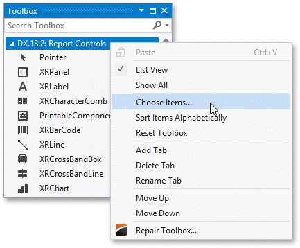
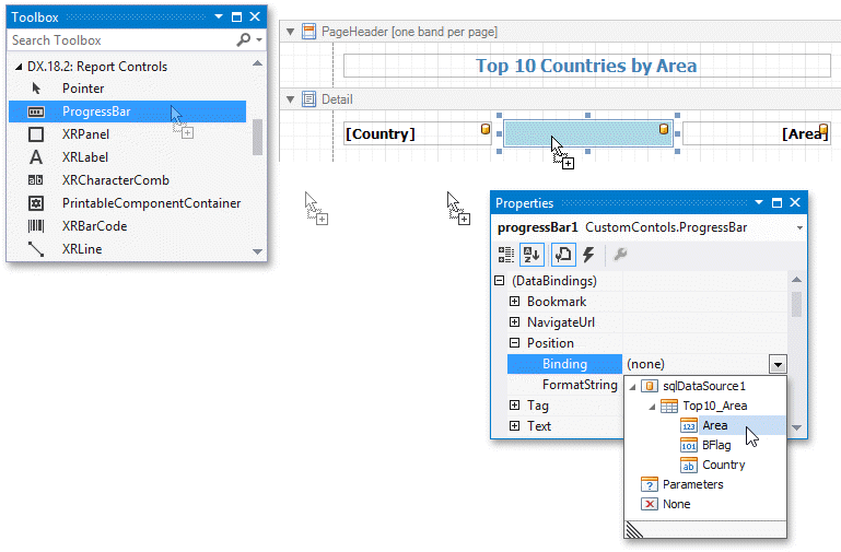
Add the ProgressBar control to the Visual Studio toolbox. To do this, show the toolbox, expand the DX.18.2: Report Controls tab, right-click the toolbox, and select Choose items….
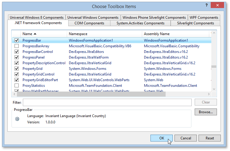
In the invoked Choose Toolbox Items dialog, click Browse…, and specify the file path to the required assembly. Check the ProgressBar control and click OK. A ProgressBar control will be added to the toolbox.
Note
To learn how to add a custom control to the End-User Designer Toolbox, refer to Make a Custom Control Available Only for a Specific Report.
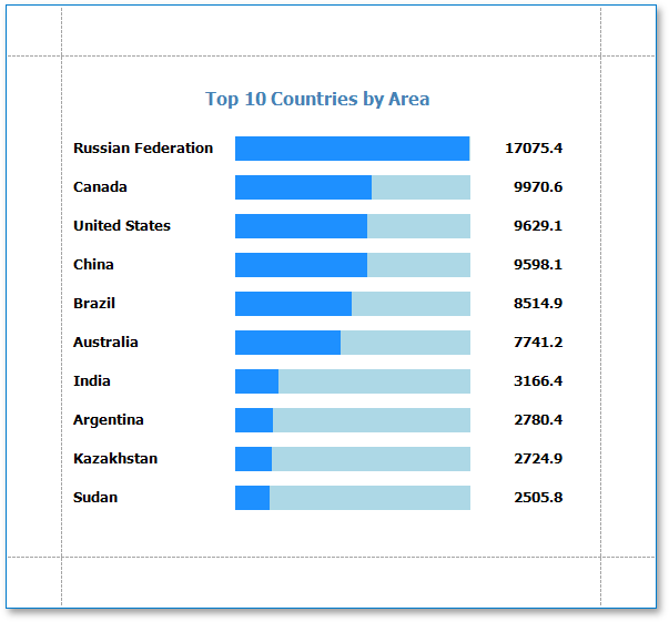
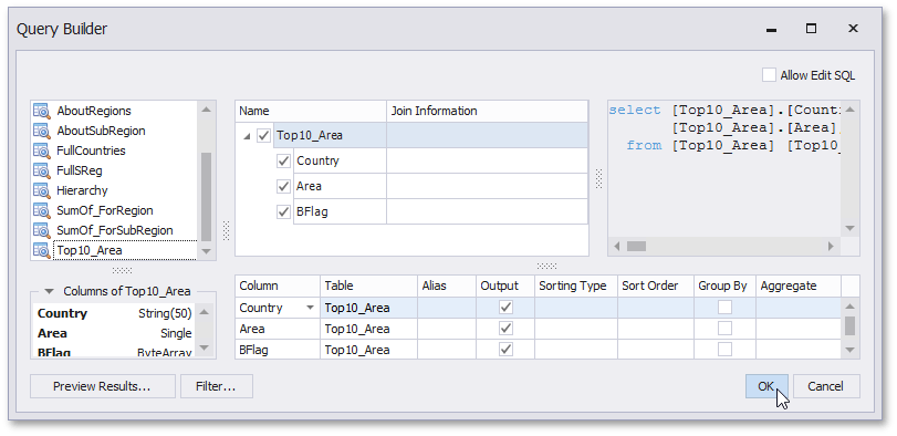
In this example, you will create a report in which the ProgressBar control represents the surface area of the 10 largest countries in the world. This data is stored in the Top10_Area data view of the CountriesDB database (the CountriesDB.mdb file that ships with the installation of the XtraReports Suite and is located in the directory where you installed the DevExpress demos). To learn more on how to bind a report to a data source, refer to Bind a Report to a Database.
Next, construct the report. For example, you can drop an XRLabel onto the PageHeaderBand, and set its text to Top 10 Countries By Area:. Also add two labels to the DetailBand and bind them to the Country and Area data fields.
Lastly, add the ProgressBar control to the Detail band. In the Properties window, expand its (DataBindings.Position.Binding) property and set it to the Area data field. Then set its MaxValue property to 17100, the BackColor property to LightBlue, and the ForeColor property to Blue.
Preview and Publish the Report
Your report is now ready to be generated. Create a Print Preview to view the result.