Workspace
- 2 minutes to read
This topic lists the WPF Theme Designer’s visual elements.
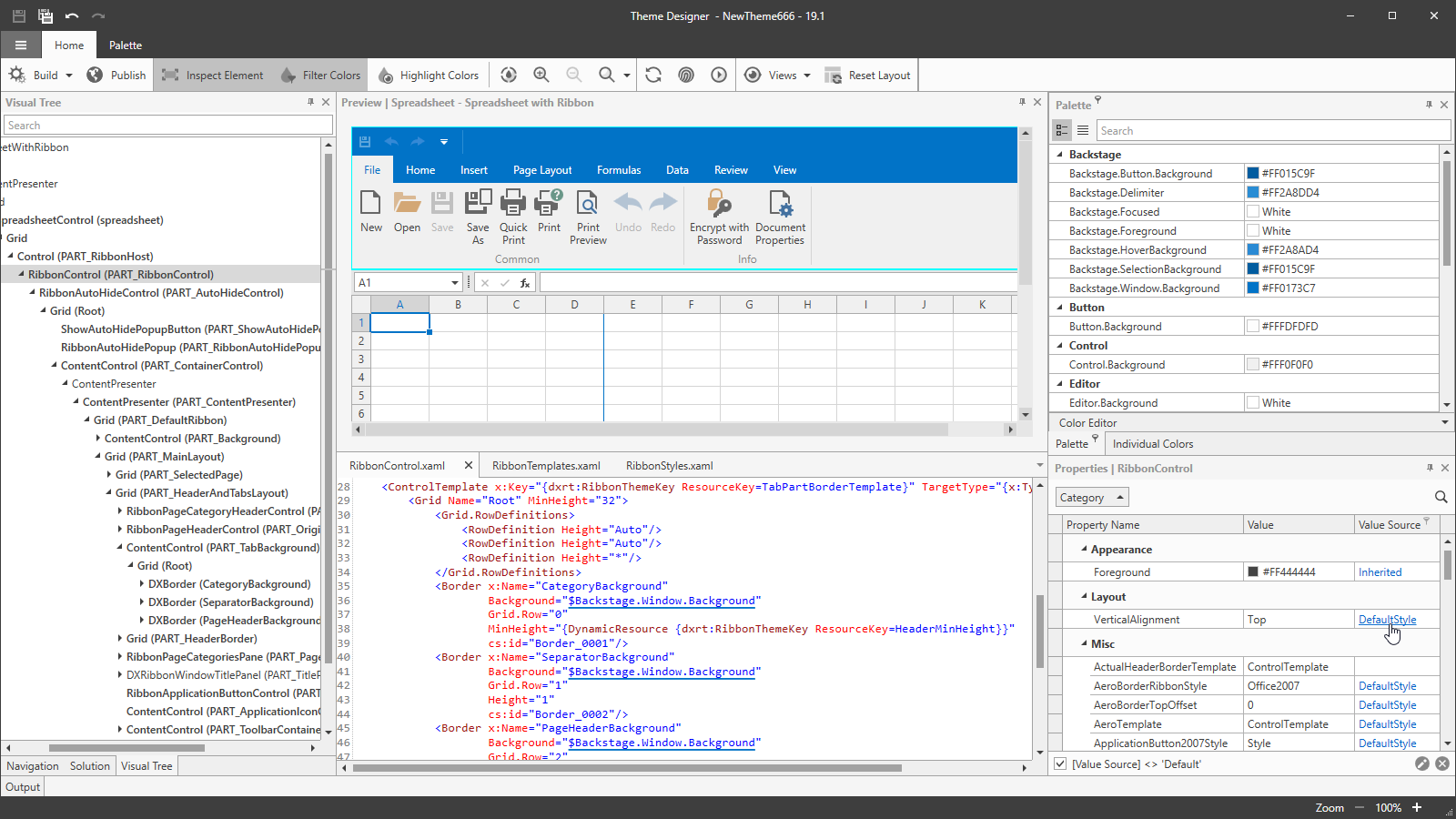
The WPF Theme Designer UI consists of the following windows:
Preview Window
The Preview Window displays the selected controls’ live preview with your theme applied.
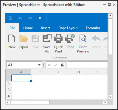
Click the TouchMode button on the ribbon to enable the theme’s touch version. Use the Reload Preview to restore the preview’s default state.
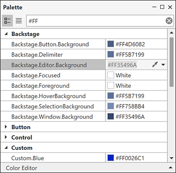
Palette Window
The Palette Window displays the current theme’s color palette. This window allows you to edit, add, and remove palette colors. The Palette view is available only for the themes which contain a palette. You can use the Inline Color Picker tool for a quick color changing. Refer to the Palette Window topic for more information.
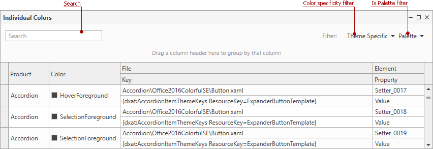
Individual Colors Window
The Individual Colors Window displays a UI element’s individual colors and allows you to edit each element’s colors and change color bindings.
CodeView Window
The CodeView Window allows you to edit templates and styles, and bind palette colors to an element in XAML.

Properties Window
The Properties Window displays the selected element’s properties. Click the hyperlink in the Value Source column to navigate to the property XAML code.

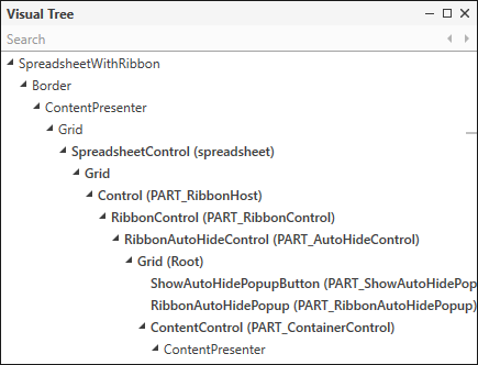
Visual Tree Window
The Visual Tree Window displays the visual tree of elements in the preview. Double-click a Visual Tree element to navigate to the element’s XAML code.
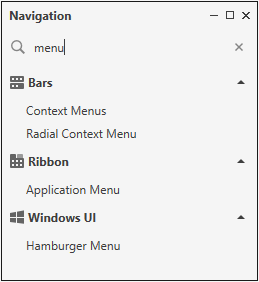
Navigation Window
The Navigation Window allows you to find and select a control to preview. The following image displays the search results for the ‘menu’ query:
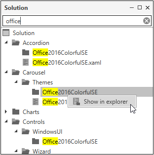
Solution Window
The Solution Window displays opened theme’s solution files. This window allows you to navigate through the files and open them in the CodeView or Windows File Explorer.
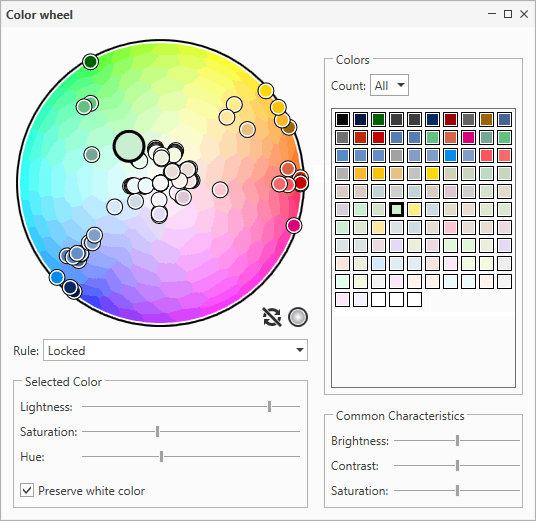
Color Wheel Window
The Color Wheel window organizes colors by hue or RGB distance into the specified number of groups. This feature allows you to customize color parameters for entire groups.
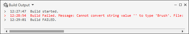
Output Window
The Output Window displays build and preview errors, notification messages, and application logs.
How to Manage the Theme Designer Workspace
Use the ribbon’s Views drop-down items to control each window’s visibility. Click the Reset Layout button to restore the Theme Designer‘s default layout.
Tip
Topic: Ribbon Commands