TreeListOptionsView.RootCheckBoxStyle Property
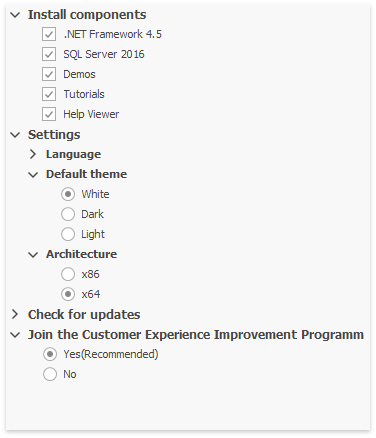
Gets or sets whether root TreeList nodes should draw check boxes, radio buttons, or neither.
Namespace: DevExpress.XtraTreeList
Assembly: DevExpress.XtraTreeList.v19.1.dll
Declaration
[DefaultValue(NodeCheckBoxStyle.Default)]
[XtraSerializableProperty]
public virtual NodeCheckBoxStyle RootCheckBoxStyle { get; set; }Property Value
| Type | Default | Description |
|---|---|---|
| DevExpress.XtraTreeList.NodeCheckBoxStyle | **Default** | A DevExpress.XtraTreeList.NodeCheckBoxStyle enumeration value that specifies whether root TreeList nodes should draw check boxes, radio buttons, or neither. The Default value means root nodes follow the global TreeListOptionsView.CheckBoxStyle setting. |
Property Paths
You can access this nested property as listed below:
| Library | Object Type | Path to RootCheckBoxStyle |
|---|---|---|
| WinForms Controls | ResourcesTree |
|
| TreeList |
|
|
| Reporting | XRDesignFieldList |
|
| XRDesignReportExplorer |
|
Remarks
You can also specify the TreeListNode.ChildrenCheckBoxStyle to specify a similar behavior for child nodes.
See Node Checking - Checkboxes and Radio Buttons to learn more.
Demo: Select With Radio Buttons and Check Boxes module in the XtraTreeList MainDemo
See Also