TreeListOptionsView.CheckBoxStyle Property
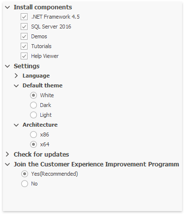
Gets or sets whether all TreeList nodes should display check boxes, radio buttons, or neither.
Namespace: DevExpress.XtraTreeList
Assembly: DevExpress.XtraTreeList.v19.2.dll
Declaration
[DefaultValue(DefaultNodeCheckBoxStyle.Default)]
[XtraSerializableProperty]
public virtual DefaultNodeCheckBoxStyle CheckBoxStyle { get; set; }Property Value
| Type | Default | Description |
|---|---|---|
| DevExpress.XtraTreeList.DefaultNodeCheckBoxStyle | **Default** | A DevExpress.XtraTreeList.DefaultNodeCheckBoxStyle enumerator value that specifies the type of content displayed by nodes. The Default value means nodes display neither check boxes, nor radio buttons. |
Property Paths
You can access this nested property as listed below:
| Library | Object Type | Path to CheckBoxStyle |
|---|---|---|
| WinForms Controls | GanttControl |
|
| ResourcesTree |
|
|
| TreeList |
|
|
| Reporting | XRDesignFieldList |
|
| XRDesignReportExplorer |
|
Remarks
You can override the CheckBoxStyle setting for specific nodes. To do that, use the TreeListOptionsView.RootCheckBoxStyle and TreeListNode.ChildrenCheckBoxStyle properties.
See Node Checking - Checkboxes and Radio Buttons to learn more.
Demo: Select With Radio Buttons and Check Boxes module in the XtraTreeList MainDemo
Example
The following code shows how to retrieve checked nodes using the TreeList.GetAllCheckedNodes method, and modify their values.
List<TreeListNode> list = treeList1.GetAllCheckedNodes();
foreach (TreeListNode node in list) {
    decimal budget = Convert.ToDecimal(node["BUDGET"])*1.1m;
    node["BUDGET"] = budget;
}