TreeList.ViewStyle Property
Gets or sets whether the control renders its data in a default Tree List style (cell borders, column headers and indicator panel are visible by default) or Tree View style (no cell borders, column headers and indicator panel).
Namespace: DevExpress.XtraTreeList
Assembly: DevExpress.XtraTreeList.v19.2.dll
Declaration
[DXCategory("Appearance")]
[DefaultValue(TreeListViewStyle.Default)]
[XtraSerializableProperty]
public TreeListViewStyle ViewStyle { get; set; }Property Value
| Type | Default | Description |
|---|---|---|
| DevExpress.XtraTreeList.TreeListViewStyle | **Default** | A value that specifies the control’s visual style. |
Remarks
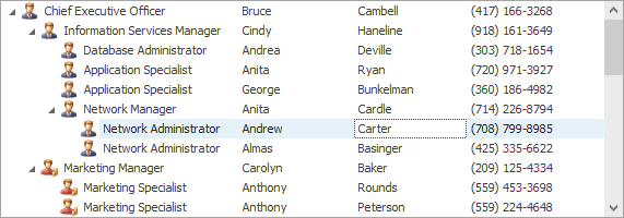
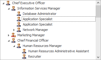
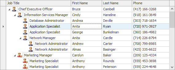
The ViewStyle property allows you to choose between the TreeView and TreeList visual styles.
TreeView style | TreeList style |
|---|---|
|
|
When the ViewStyle property is set to Default, the actual view style is dependent on the TreeList.TreeViewColumn and TreeList.TreeViewFieldName properties. If the TreeList.TreeViewColumn property refers to a valid column, or the TreeList.TreeViewFieldName property is set to a non-empty string (in bound mode), the actual view style is TreeListViewStyle.TreeView. Otherwise, the actual view style is TreeListViewStyle.MultiColumnTreeList.
See TreeView Style to learn more.
Related GitHub Examples
The following code snippet (auto-collected from DevExpress Examples) contains a reference to the ViewStyle property.
Note
The algorithm used to collect these code examples remains a work in progress. Accordingly, the links and snippets below may produce inaccurate results. If you encounter an issue with code examples below, please use the feedback form on this page to report the issue.