ToolboxControl Class
Displays multiple sets of items and automatically initiates drag-and-drop operations when an end-user starts dragging these items.
Namespace: DevExpress.XtraToolbox
Assembly: DevExpress.XtraBars.v21.2.dll
NuGet Packages: DevExpress.Win.Design, DevExpress.Win.Navigation
Declaration
public class ToolboxControl :
    BaseStyleControl,
    IToolboxControl,
    IMouseWheelSupport,
    IGestureClient,
IDisposableRemarks
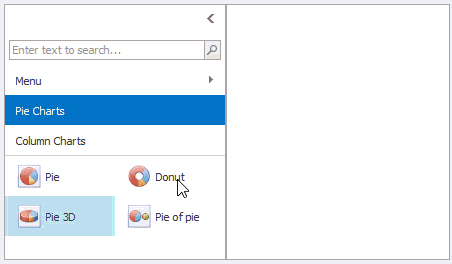
The ToolboxControl provides built-in support for drag-and-drop operations of its items to external controls. The following image demonstrates a sample ToolboxControl that contains two groups (Pie Charts and Column Charts), each providing a set of items. Each time an item is dropped, the ToolboxControl.DragItemDrop event fires, which allows you to implement certain actions.
When an end-user starts dragging a toolbox item, a drag-and-drop operation is automatically initiated. To customize the drag-and-drop operation’s settings and complete the operation (e.g. drop the dragged item onto an external surface), handle these events:
- ToolboxControl.DragItemStart - Fires when an item’s drag operation starts. Allows you to replace the cursor icon and cancel the drag operation.
- ToolboxControl.DragItemMove - Fires during item dragging. Allows you to specify the drop effect in the current position.
- ToolboxControl.DragItemCancel - Fires when a drag operation is canceled.
- ToolboxControl.DragItemDrop - Fires after an item has been dropped. Allows you to perform custom actions on item dropping.
To perform actions on a double-click, handle the ToolboxControl.ItemDoubleClick event.
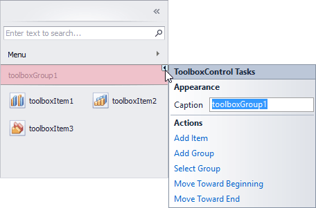
Items in the ToolboxControl are combined into groups. Thus, to add items, you first need to add a group(s) to the ToolboxControl.Groups collection, and then add items to this group using the ToolboxGroup.Items collection. At design time, you can populate the ToolboxControl with groups and items using smart tags.
The control’s additional features include:
- Embedded search box - This editor allows end-users to quickly locate items by their captions (see ToolboxOptionsView.ShowSearchPanel).
- Control’s minimization feature - Allows end-users to collapse the control to a small bar (see ToolboxControl.OptionsMinimizing).
- Quick access to item groups with the built-in menu (see ToolboxOptionsView.ShowMenuButton).
- Multiple item selection feature (see ToolboxOptionsBehavior.ItemSelectMode)
Tooltips
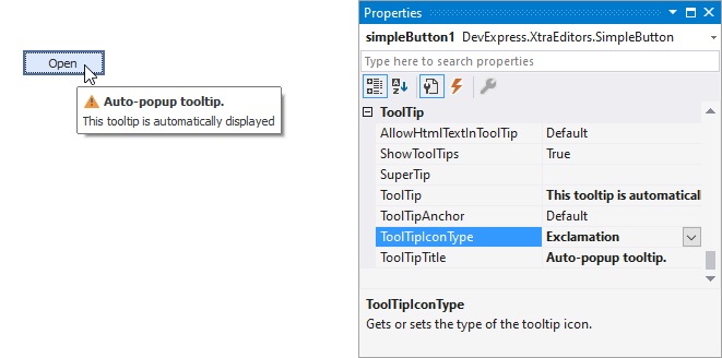
DevExpress controls support regular and super tooltips. If the ShowToolTips option is enabled, tooltips are shown when the mouse pointer hovers over the control.
Use the following properties to specify a regular tooltip’s content:
- ToolTip — A regular tooltip’s text. If the text is not specified, the tooltip is not displayed even if the title is specified. You can use line breaks in regular tooltips. Use the AllowHtmlTextInToolTip property to specify whether to parse HTML tags in the text. HTML tags allow you to format the text: size, style, hyperlinks, etc.
- ToolTipTitle — A regular tooltip’s title. If the title is not specified, it is not displayed.
ToolTipIconType — A regular tooltip’s predefined icon. Use the controller’s IconSize property to specify the image size.
To display a custom image in all regular tooltips, use the controller’s ImageList and ImageIndex properties.
To display a custom image in a specific regular tooltip, handle the BeforeShow event. Use the ImageOptions event argument to assign a raster or vector image to the processed tooltip.
Use the SuperTip property to assign a super tooltip to a control. Enable the AllowHtmlText property to use HTML tags in the super tooltip.
To replace regular tooltips with super tooltips, set the ToolTipController.ToolTipType property to SuperTip. The controller automatically converts regular tooltips to super tooltips. To access this property, you can use the DefaultToolTipController component or a custom controller assigned to the ToolTipController property. See the following topic for more information: Tooltips.