NavElement.AllowGlyphSkinning Property
Gets or sets whether the current NavElement‘s icon should be painted in this item’s foreground color.
Namespace: DevExpress.XtraNavBar
Assembly: DevExpress.XtraNavBar.v19.1.dll
Declaration
Property Value
| Type | Default | Description |
|---|---|---|
| DefaultBoolean | **Default** | true, if the current NavElement‘s icon should be painted in this item’s foreground color; otherwise, false. |
Available values:
| Name | Description |
|---|---|
| True | Corresponds to a Boolean value of true. |
| False | Corresponds to a Boolean value of false. |
| Default | The value is determined by the current object’s parent object setting (e.g., a control setting). |
Remarks
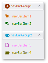
NavBarControl supports the Glyph Skinning feature that helps you to build monochrome interfaces. NavBarControl items (NavBarItems and NavBarGroups) can paint their icons in the same color as their captions. To enable the Glyph Skinning feature for the entire control, set the NavBarControl.AllowGlyphSkinning property to true. You can also override this setting for individual items via the AllowGlyphSkinning property. The figure below illustrates a NavBarControl with the Glyph Skinning feature enabled.
For best visual results, we recommend using gray-scale icons from the DevExpress Image Gallery.
NavBarControl is not the only control that supports this feature. See the Glyph Skinning topic for the complete controls list.