NavBarGroup Class
A group within a NavBarControl control.
Namespace: DevExpress.XtraNavBar
Assembly: DevExpress.XtraNavBar.v18.2.dll
Declaration
Related API Members
The following members return NavBarGroup objects:
Remarks
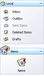
A NavBarControl consists of one or more NavBarGroup objects which visually represent command containers. The following image shows a NavBarControl consisting of two groups (Local and News):
To add a command to a group, a specific NavBarItem must be added to the NavBarGroup.ItemLinks collection. When an item is added to a group, a NavBarItemLink is automatically created that refers to the current item. The created link is added to the group instead of the item itself. This approach allows you to have links to the same NavBar item within multiple groups.
Links within a group can be displayed using large or small images, with or without text. Use the NavBarGroup.GroupStyle property to customize the link display mode.
You can display a custom control within a group. To do this, set the NavBarGroup.GroupStyle property to ControlContainer. This automatically creates a NavBarGroupControlContainer control and displays it within the specified group. Then, you can place any controls onto the container and these will be displayed when the group is expanded. See NavBarGroupControlContainer to learn more.
To access and modify the collection of groups within a NavBarControl, use the NavBarControl.Groups property. Properties provided by the NavBarGroup object give you the ability to control the behavior of the group and its associated links.
A group can be either expanded or collapsed. Specific paint views allow only a single group to be expanded at one time, while in other paint styles, it’s possible to have multiple expanded groups simultaneously. To control the expansion status, use the NavBarGroup.Expanded property.
Example
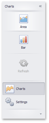
This example shows how to create a NavBarControl in code.The NavBarControl will have two groups ('Charts' and 'Settings') with items. Item link selection is enabled by setting the LinkSelectionMode property to LinkSelectionModeType.OneInGroupAndAllowAutoSelect. To respond to a link selection, the SelectedLinkChanged event is handled. In the OneInGroupAndAllowAutoSelect mode, each group can have a single selected link independent of other groups. When a group is activated and it has no selected link, the first link is auto-selected. At runtime, you will see that the SelectedLinkChanged event fires on group activation, while the LinkClicked event does not. The example demonstrates two methods of assigning images to navbar items:1) explicit assignment of Image objects to items (see the 'Charts' navbar group item initialization);2) implicit assignment, using image indexes (see the 'Settings' navbar group item initialization).
Note
A complete sample project is available at https://github.com/DevExpress-Examples/how-to-create-a-navbarcontrol-in-code-e5096
using System;
using System.Collections.Generic;
using System.ComponentModel;
using System.Data;
using System.Drawing;
using System.Linq;
using System.Text;
using System.Threading.Tasks;
using System.Windows.Forms;
using DevExpress.XtraNavBar;

namespace CreateNavBar {
    public partial class Form1 : Form {
        public Form1() {
            InitializeComponent();
        }

        private void Form1_Load(object sender, EventArgs e) {
            // Create a NavBarControl.
            NavBarControl navBar = new NavBarControl();
            this.Controls.Add(navBar);
            navBar.Width = 150;
            navBar.Dock = DockStyle.Left;
            // Apply the "NavigationPaneView" style.
            navBar.PaintStyleKind = NavBarViewKind.NavigationPane;

            // Create the 'Charts' navbar group.
            NavBarGroup groupChart = new NavBarGroup("Charts");
            // Display a large image in the group caption.
            groupChart.LargeImage = global::CreateNavBar.Properties.Resources.chart_32x32;
            // Create an 'Area' item and assign an image to it from the project resources.
            NavBarItem itemChartArea = new NavBarItem("Area");
            itemChartArea.LargeImage = global::CreateNavBar.Properties.Resources.area_32x32;
            // Create a 'Bar' item.
            NavBarItem itemChartBar = new NavBarItem("Bar");
            itemChartBar.LargeImage = global::CreateNavBar.Properties.Resources.bar_32x32;
            // Create a disabled 'Refresh' item.
            NavBarItem itemChartRefresh = new NavBarItem("Refresh");
            itemChartRefresh.LargeImage = global::CreateNavBar.Properties.Resources.refresh_32x32;
            itemChartRefresh.Enabled = false;

            //Assign an image collection to the NavBarControl.
            //Images from this collection are used in the 'Settings' navbar group
            navBar.LargeImages = imageCollection1;

            // Create the 'Settings' navbar group.
            NavBarGroup groupSettings = new NavBarGroup("Settings");
            // Display a large image in the group caption.
            groupSettings.LargeImage = global::CreateNavBar.Properties.Resources.customize_32x32;
            // Create an 'Edit Settings' item and assign a large image to it by its index in the navBar.LargeImages collection.
            NavBarItem itemEditSettings = new NavBarItem("Edit Settings");
            itemEditSettings.LargeImageIndex = 0;
            // Create an Export item and assign a large image to it by its index in the navBar.LargeImages collection.
            NavBarItem itemExport = new NavBarItem("Export");
            itemExport.LargeImageIndex = 1;

            // Add the created items to the groups and the groups to the NavBarControl.
            // Prevent excessive updates using the BeginUpdate and EndUpdate methods.
            navBar.BeginUpdate();

            navBar.Groups.Add(groupChart);
            groupChart.ItemLinks.Add(itemChartArea);
            groupChart.ItemLinks.Add(itemChartBar);
            // Add a separator.
            groupChart.ItemLinks.Add(new NavBarSeparatorItem());
            groupChart.ItemLinks.Add(itemChartRefresh);
            //Enable the display of large images in the group.
            groupChart.GroupStyle = NavBarGroupStyle.LargeIconsText;

            navBar.Groups.Add(groupSettings);
            groupSettings.ItemLinks.Add(itemEditSettings);
            groupSettings.ItemLinks.Add(itemExport);
            //Enable the display of large images in the group.
            groupSettings.GroupStyle = NavBarGroupStyle.LargeIconsText;

            // Activate the 'Charts' group.
            navBar.ActiveGroup = groupChart;

            // Specify the event handler to process item clicks.
            navBar.LinkClicked += new NavBarLinkEventHandler(navBar_LinkClicked);
            // Specify the event handler to process item selection.
            navBar.SelectedLinkChanged += navBar_SelectedLinkChanged;

            // Enable link selection.
            // Each group can have a single selected link independent of other groups.
            // When a group is activated and it has no selected link, the first link is auto-selected.
            // At runtime, you will see that the SelectedLinkChanged event fires on group activation,
            // while the LinkClicked event does not.
            navBar.LinkSelectionMode = LinkSelectionModeType.OneInGroupAndAllowAutoSelect;
            navBar.EndUpdate();

            // Manually select the second link:
            //groupChart.SelectedLinkIndex = 1;
        }

        void navBar_SelectedLinkChanged(object sender, DevExpress.XtraNavBar.ViewInfo.NavBarSelectedLinkChangedEventArgs e) {
            string s = string.Format("'{0}' selected", e.Link.Caption);
            listBoxControl1.Items.Add(s);
        }

        void navBar_LinkClicked(object sender, NavBarLinkEventArgs e) {
            string s = string.Format("'{0}' clicked", e.Link.Caption);
            listBoxControl1.Items.Add(s);
        }

    }
}