LayoutControlItem.AllowGlyphSkinning Property
Gets or sets whether the LayoutControlItem‘s icon should be painted in the item’s foreground color.
Namespace: DevExpress.XtraLayout
Assembly: DevExpress.XtraLayout.v19.2.dll
Declaration
[Browsable(false)]
[DefaultValue(DefaultBoolean.Default)]
[DXCategory("Behavior")]
[XtraSerializableProperty]
public DefaultBoolean AllowGlyphSkinning { get; set; }Property Value
| Type | Default | Description |
|---|---|---|
| DefaultBoolean | **Default** | A DefaultBoolean enumerator value that specifies whether the LayoutControlItem‘s icon should be painted in the item’s foreground color. |
Available values:
| Name | Description |
|---|---|
| True | Corresponds to a Boolean value of true. |
| False | Corresponds to a Boolean value of false. |
| Default | The value is determined by the current object’s parent object setting (e.g., a control setting). |
Remarks
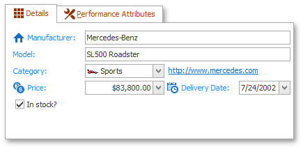
The Glyph Skinning feature allows you to paint item icons as the same color, as the item’s text. Use this feature to build monochrome UIs for your applications. The AllowGlyphSkinning property has the highest priority for individual LayoutControlItems and overrides the LayoutGroup.AllowGlyphSkinning and OptionsView.AllowGlyphSkinning properties, which specify the Glyph Skinning feature settings common to all LayoutControlItems within a LayoutGroup or entire LayoutControl respectively.
The following figure demonstrates a LayoutControl with 2 LayoutGroups. Both LayoutGroup headers and LayoutControlItems within the ‘Details’ group are painted with the Glyph Skinning feature.
LayoutControl is not the only control that supports the Glyph Skinning feature. See the Glyph Skinning topic for the complete control list.