LayoutViewAppearances.CardCaption Property
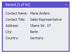
Provides access to the default appearance settings used to paint card captions in a LayoutView.
Namespace: DevExpress.XtraGrid.Views.Layout
Assembly: DevExpress.XtraGrid.v19.1.dll
Declaration
Property Value
| Type | Description |
|---|---|
| AppearanceObject | The default appearance settings used to paint card captions in a LayoutView. |
Remarks
Use the following settings provided by the CardCaption property to customize the default appearance settings used to paint card captions:
the CardCaption.BorderColor setting to change the card caption background and border color.
In different skins and control states, the control can apply the specified color as is, apply the color’s hue or blend the color with a corresponding skin element.
- the CardCaption.ForeColor setting to change the text color. This property is in effect in any of the following cases: 1)the BorderColor setting is not set; 2) the WindowsFormsSettings.AutoCorrectForeColor property is set to False.
- the CardCaption.Font* settings to adjust the text font attributes.

You can override these settings for the focused card and individual cards, using the LayoutViewAppearances.FocusedCardCaption property and LayoutView.CustomCardStyle event, respectively.
To display small icons within card captions, handle the LayoutView.CustomCardCaptionImage event.
Refer to the Appearance and Conditional Formatting document for information on appearances.