GridView.DetailTabStyle Event
Allows you to specify appearance settings for tab captions and assign images to tabs.
Namespace: DevExpress.XtraGrid.Views.Grid
Assembly: DevExpress.XtraGrid.v21.1.dll
NuGet Packages: DevExpress.Win.Design, DevExpress.Win.Grid
Declaration
[DXCategory("MasterDetail")]
public event EventHandler<DetailTabStyleEventArgs> DetailTabStyleEvent Data
The DetailTabStyle event's data class is DetailTabStyleEventArgs. The following properties provide information specific to this event:
| Property | Description |
|---|---|
| Appearance | Provides access to settings that specify tab appearance. |
| Caption | Gets or sets the tab caption. |
| ImageOptions | Provides access to options that specify a raster or vector image displayed in the tab. |
| Images | Gets or sets a collection of raster or vector images that can be displayed in the tab. |
| IsSelected | Gets whether the tab is selected. |
| PatternView | Gets a view used as a template to create a view that actually appears on the screen. |
| RelationIndex | Gets the relation index that identifies the affected detail. Inherited from CustomMasterRowEventArgs. |
| RowHandle | Gets the handle of the currently processed master row in the current View. Inherited from CustomMasterRowEventArgs. |
Remarks
A detail view’s ViewCaption property allows you to specify a caption that is displayed in a detail tab. Ensure that the ShowDetailTabs option is enabled; otherwise, tabs are not displayed. If the EnableDetailToolTip option is enabled, this caption is also displayed in detail tooltips.
If the caption is not specified, the detail view uses the LevelName property value.
Custom Images and Appearance Settings for Individual Detail Tabs
The DetailTabStyle event fires for each detail view. This event allows you to assign a custom image to the processed tab and apply custom appearance settings to the tab caption.
Use the Caption event argument to obtain or change the processed tab caption. The following arguments allow you to specify the tab style:
- Appearance — provides access to background and foreground colors, font style, and so forth.
- ImageOptions — provides access to a raster or vector image assigned to the tab.
You can also use the IsSelected argument to apply a specific style depending on whether the tab is selected.
The RefreshDetailTab(Int32) method allows you to update a detail tab at runtime.
HTML-Formatted Tab Captions
You can enable the master view’s AllowHtmlDrawDetailTabs option to parse HTML-inspired tags in detail tab captions.
Example
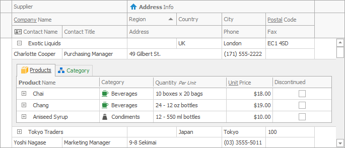
The code below handles the DetailTabStyle event to specify the foreground color, font style for tab captions and assign images to tabs. The image below illustrates the Products and Category tabs with custom styles.
void advBandedGridView1_DetailTabStyle(object sender, DetailTabStyleEventArgs e) {
    if (e.Caption == "Products") {
        e.ImageOptions.SvgImage = svgImageCollection1["product"];
    }
    if (e.Caption == "Category") {
        e.Appearance.Header.ForeColor = DevExpress.LookAndFeel.DXSkinColors.FillColors.Success;
        e.ImageOptions.SvgImage = svgImageCollection1["category"];
    }
    if (e.IsSelected) {
        e.Appearance.Header.FontStyleDelta = FontStyle.Underline;
    }
}