GridOptionsView.HeaderFilterButtonShowMode Property
Gets or sets the display style of column filter buttons.
Namespace: DevExpress.XtraGrid.Views.Grid
Assembly: DevExpress.XtraGrid.v19.1.dll
Declaration
[DefaultValue(FilterButtonShowMode.Default)]
[XtraSerializableProperty]
public virtual FilterButtonShowMode HeaderFilterButtonShowMode { get; set; }Property Value
| Type | Default | Description |
|---|---|---|
| FilterButtonShowMode | **Default** | A FilterButtonShowMode enumeration value which specifies the display style of column filter buttons. |
Available values:
| Name | Description |
|---|---|
| Default | The same as the FilterButtonShowMode.SmartTag option. |
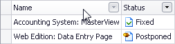
| Button | Filter buttons are rendered as buttons. They are displayed when a column is filtered or when the mouse cursor hovers over the column header.
|
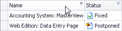
| SmartTag | Filter buttons are rendered as small tags. They are displayed when a column is filtered or when the mouse cursor hovers over the column header.
|
Property Paths
You can access this nested property as listed below:
| Object Type | Path to HeaderFilterButtonShowMode |
|---|---|
| AdvBandedGridView |
|
| BandedGridView |
|
| GridView |
|
Remarks
Column filter buttons are displayed when a column is filtered or when the mouse cursor hovers over the column header. If column headers occupy more than one line due to the GridOptionsView.ColumnHeaderAutoHeight property set to true, filter buttons are always visible if the HeaderFilterButtonShowMode property is set to Button.