GridOptionsView.AllowGlyphSkinning Property
Gets or sets whether column and band icons within the current View should be painted with the same colors as the column captions.
Namespace: DevExpress.XtraGrid.Views.Grid
Assembly: DevExpress.XtraGrid.v19.2.dll
Declaration
[DefaultValue(false)]
[XtraSerializableProperty]
public virtual bool AllowGlyphSkinning { get; set; }Property Value
| Type | Default | Description |
|---|---|---|
| Boolean | **false** | true, if column and band icons within the current View should be painted with the same colors as the column captions; otherwise, false. |
Property Paths
You can access this nested property as listed below:
| Object Type | Path to AllowGlyphSkinning |
|---|---|
| AdvBandedGridView |
|
| BandedGridView |
|
| GridView |
|
Remarks
You can apply custom grid column GridColumn.Captions and band GridBand.Caption fore colors via the GridColumn.AppearanceHeader and GridBand.AppearanceHeader properties respectively. Icons for these columns and bands can attain these custom color hues. To do so, set the AllowGlyphSkinning property to true. This feature is called Glyph Skinning and allows you to build monochrome UIs for your applications.
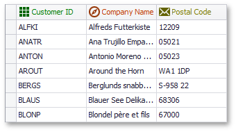
The figure below illustrates a GridView, columns within which are painted using the Glyph Skinning feature.
If you build a monochrome UI, we recommend the gray-scale icons from the DevExpress Image Gallery for the best visual results.
GridControl is not the only control that supports this feature. See the Glyph Skinning topic for the complete control list.