GaugeControl Class
Allows you to create gauges of various types - circular, linear, digital and state indicators.
Namespace: DevExpress.XtraGauges.Win
Assembly: DevExpress.XtraGauges.v18.2.Win.dll
Declaration
[ComVisible(false)]
[ToolboxBitmap(typeof(PointF2DConverter), "Images.GaugeControl.Win.bmp")]
public class GaugeControl :
    GaugeControlBase,
    IToolTipControlClient,
    IAnyControlEdit,
    ICloneable,
ISupportXtraSerializerRelated API Members
The following members return GaugeControl objects:
Remarks
This is the primary control of the XtraGauges Suite you initially work with. A Gauge Control can display one or multiple gauges at the same time, and gauges can be of the same or different types:
- CircularGauge objects have a circular, semi-circular or any round scale. They are appropriate for creating speedometers, tachometers, stopwatches, clocks, etc.
- LinearGauge objects are horizontally or vertically oriented bars with scales, appropriate for creating thermometers and progress displays.
- DigitalGauge objects display text or numbers like LEDS do. Numbers can be painted using a 7 or 14 segment display style, and text can be painted using the 14 segment display style.
- StateIndicatorGauge objects imitate static devices or simple indicators that have a fixed set of states.
To access gauges owned by a Gauge Control, use the control’s DevExpress.XtraGauges.Win.GaugeControlBase.Gauges property.
Example
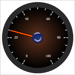
The following example shows how to create a circular gauge.
In the example, a circular gauge is created using the GaugeControlBase.AddCircularGauge method. The default elements (a scale, background layer, needle and spindle cap) are added to the circular gauge via the CircularGauge.AddDefaultElements method. Then, some of them are customized in a specific manner.
The result is displayed below:
using DevExpress.XtraGauges.Win;
using DevExpress.XtraGauges.Win.Gauges.Circular;
using DevExpress.XtraGauges.Core.Model;

GaugeControl gc = new GaugeControl();

// Add a circular gauge.
CircularGauge circularGauge = gc.AddCircularGauge();

// Add the default elements (a scale, background layer, needle and spindle cap).
circularGauge.AddDefaultElements();

// Change the background layer's paint style.
ArcScaleBackgroundLayer background = circularGauge.BackgroundLayers[0];
background.ShapeType = BackgroundLayerShapeType.CircularFull_Style3;

// Customize the scale's settings.
ArcScaleComponent scale = circularGauge.Scales[0];
scale.MinValue = 0;
scale.MaxValue = 100;
scale.Value = 25;
scale.MajorTickCount = 6;
scale.MajorTickmark.FormatString = "{0:F0}";
scale.MajorTickmark.ShapeType = TickmarkShapeType.Circular_Style2_2;
scale.MajorTickmark.ShapeOffset = -9;
scale.MajorTickmark.AllowTickOverlap = true;
scale.MinorTickCount = 3;
scale.MinorTickmark.ShapeType = TickmarkShapeType.Circular_Style2_1;

// Change the needle's paint style.
ArcScaleNeedleComponent needle = circularGauge.Needles[0];
needle.ShapeType = NeedleShapeType.CircularFull_Style3;

// Add the gauge control to the form.
gc.Size = new Size(250, 250);
gc.Parent = this;
Related GitHub Examples
The following code snippet (auto-collected from DevExpress Examples) contains a reference to the GaugeControl class.
Note
The algorithm used to collect these code examples remains a work in progress. Accordingly, the links and snippets below may produce inaccurate results. If you encounter an issue with code examples below, please use the feedback form on this page to report the issue.