FilterEditorControl Class
Allows users to build filter criteria and apply them to controls and data sources. Supports visual and text criteria edit modes.
Namespace: DevExpress.DataAccess.UI
Assembly: DevExpress.DataAccess.v23.2.UI.dll
NuGet Package: DevExpress.DataAccess.UI
Declaration
public class FilterEditorControl :
    BaseStyleControl,
    IFilterControl,
    ISupportEditorTextConverter,
    ISupportContextCustomization,
IFilterControlOwnerRemarks
The FilterEditorControl allows users to build a filter criterion and apply it to the attached control or data source. The control supports visual and text criteria edit modes.

Tip
Run the XtraGrid demo to try out the FilterEditorControl.
Note
Since version 18.1, the filter editor in the grid control, in the tree list, and other data-aware controls uses the DevExpress.DataAccess.UI.FilterEditorControl. Disable the static (Shared in VB) WindowsFormsSettings.UseAdvancedFilterEditorControl property to use the legacy DevExpress.XtraFilterEditor.FilterEditorControl.
Binding to Source Control
The SourceControl property specifies the data control or data source to which the FilterEditorControl is attached.
When the filter criteria changes in the source control (for instance, by the user or in code), the FilterEditorControl automatically reflects the changes.
Filter Criteria
The FilterCriteria property gets or sets the CriteriaOperator object that specifies the filter criteria. The FilterString property specifies the string expression that corresponds to the filter criteria. See the Criteria Language Syntax for more information.
When the filter criteria changes, the FilterEditorControl does not automatically apply it to the source control. Call the ApplyFilter() method to apply the filter criteria. To clear the filter criteria and apply it, call the ClearFilter() method.
If the ReadOnly option is enabled, users cannot edit filter criteria. You can still edit the filter criteria in code.
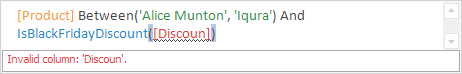
Visual and Text Edit Modes
The ViewMode property specifies whether to enable the Visual and/or Text edit mode.

See end-user capabilities in both modes below.
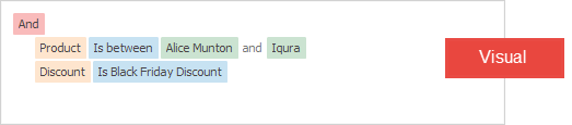
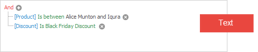
Visual and Text Criteria Display Style
In Visual edit mode, the static (Shared in VB) WindowsFormsSettings.FilterCriteriaDisplayStyle property specifies whether to enable the Visual or Text criteria display style.
Note
To change the criteria display style in an embedded filter editor, use the data-aware control’s corresponding properties:
- GridView.OptionsView.FilterCriteriaDisplayStyle - for the grid control
- TreeList.OptionsView.FilterCriteriaDisplayStyle - for the tree list control
- VGridControl.OptionsView.FilterCriteriaDisplayStyle - for the vertical grid control
- PivotGrid.OptionsView.FilterCriteriaDisplayStyle - for the pivot grid control
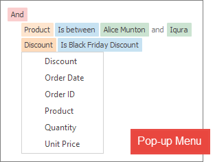
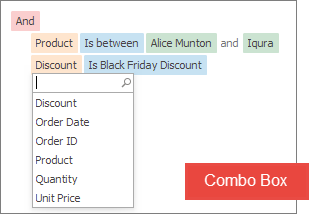
Pop-up Menu or Combo Box to Edit Operators and Operands
The UseMenuForOperandsAndOperators property specifies whether to use a pop-up menu or a combo box to edit operators and operands. The combo box displays a search box in the drop-down list and the vertical scroll bar (when the item count exceeds the list’s capacity).
Unbound Mode
You can also use the FilterEditorControl even if it is not bound to a source control (the SourceControl property equals null). Users can build filter criteria that you can get from the FilterCriteria or FilterString property. In unbound mode, use the SetFilterColumnsCollection(FilterColumnCollection) method to populate the FilterColumns collection with columns by which data should be filtered (this collection is populated automatically in bound mode).
The code below adds a new unbound column of the string type.
FilterColumnCollection unboundFilterColumnCollection = new FilterColumnCollection();
RepositoryItemTextEdit nameEdit = new RepositoryItemTextEdit();
UnboundFilterColumn unboundFilterColumn = new UnboundFilterColumn("Name", "Name", typeof(string), nameEdit, DevExpress.Data.Filtering.Helpers.FilterColumnClauseClass.String);
unboundFilterColumnCollection.Add(unboundFilterColumn);
filterEditorControl1.SetFilterColumnsCollection(unboundFilterColumnCollection);
End-user Capabilities
Visual Edit Mode
The control arranges filter criteria in a tree structure in visual mode:
- branch nodes in the tree are group logical operators (‘And’, ‘Or’, ‘Not And’, ‘Not Or’)
leaf nodes are filter conditions (for example, ‘Discount is more than 15%’)

Users can click on a group to change the logical operator.

The + button is displayed next to a group. Users can click this button to add a new group or condition to the current group.

The x button removes the group or condition.
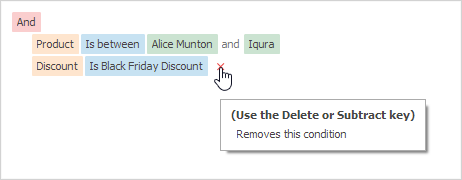
When the user clicks a condition or group, an editor pops-up automatically. The user can hold Ctrl and click a condition or group to select it without invoking an editor. When a condition or group is selected, the user can press Delete to remove it, or Space to invoke an editor.
Text Edit Mode
The text panel features include the following:
math, aggregate, date-time, and other functions that can be used to calculate values

tooltips that are displayed for columns and functions
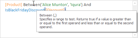
syntax errors are highlighted