SvgImageBox.ToolTipController Property
Gets or sets a ToolTipController that allows items to show tooltips.
Namespace: DevExpress.XtraEditors
Assembly: DevExpress.Utils.v20.2.dll
NuGet Packages: DevExpress.Utils, DevExpress.Wpf.Core
Declaration
[DefaultValue(null)]
[DXCategory("ToolTip")]
public ToolTipController ToolTipController { get; set; }Property Value
| Type | Default | Description |
|---|---|---|
| ToolTipController | *null* | Manages tooltips for SvgImageBox items. |
Remarks
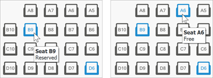
SvgImageItems show regular hints and super tooltips if the ShowToolTips property is enabled. To assign tooltips, use the ToolTip and/or SuperTip properties.
The ToolTipController property allows you to assign a stand-alone controller and modify tooltips at runtime. To do that, handle the ToolTipController.BeforeShow event. Read the e.SelectedObject property to identify which item a user hovers, and set the correspondinge.Tooltip or e.SuperTip value. The code sample below illustrates how tooltips are assigned to SvgImageBox items in the DevExpress “SvgImage Box” Demo Center module.
svgImageBox.ToolTipController = toolTipController;
toolTipController.BeforeShow +=
    new DevExpress.Utils.ToolTipControllerBeforeShowEventHandler(this.OnBeforeShowToolTip);

void OnBeforeShowToolTip(object sender, Utils.ToolTipControllerShowEventArgs e) {
    var svgImageItem = e.SelectedObject as SvgImageItem;
    if(svgImageItem == null) return;
    e.ToolTip = string.Format(
        e.ToolTip,(svgImageItem.Tag as string).ToUpper(),
        svgImageItem.Selected ? "Reserved" : "Free");
}