SeparatorControl Class
Allows you to delimit controls within the layout.
Namespace: DevExpress.XtraEditors
Assembly: DevExpress.Utils.v23.2.dll
NuGet Packages: DevExpress.Utils, DevExpress.Wpf.Core
Declaration
Remarks
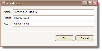
The SeparatorControl displays a separator that allows you to detach controls within the layout. See the example below.
The separator can be oriented horizontally or vertically. To specify the orientation of the Separator Control, use the SeparatorControl.LineOrientation property. The alignment of the separator within the control surface can be specified with the SeparatorControl.LineAlignment property.
The control client area size can be explicitly specified using the Size inherited property. Also, you can set the SeparatorControl.AutoSizeMode property to true to automatically calculate the control width or height, depending on whether the separator is vertically or horizontally oriented, based on the amount of space around the separator (see SeparatorControl.Padding). In this case, the other dimension can be still explicitly specified.
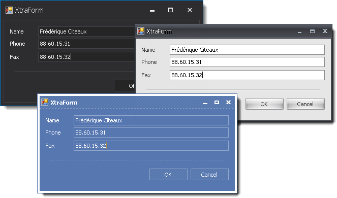
The separator is rendered based on the currently applied skin. See the figure below.
If any other paint theme except skins is applied, you can use the SeparatorControl.LineColor, SeparatorControl.LineStyle and SeparatorControl.LineThickness properties to specify the Separator Control appearance settings.