RepositoryItemTimeEdit.PopupBorderStyle Property
Gets or sets the border style of the editor’s dropdown window.
Namespace: DevExpress.XtraEditors.Repository
Assembly: DevExpress.XtraEditors.v19.2.dll
Declaration
[DefaultValue(PopupBorderStyles.Default)]
[Browsable(true)]
public override PopupBorderStyles PopupBorderStyle { get; set; }Property Value
| Type | Default | Description |
|---|---|---|
| PopupBorderStyles | **Default** | A PopupBorderStyles enumeration value specifying the border style of the editor’s dropdown window. |
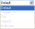
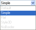
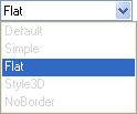
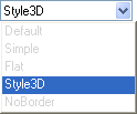
Available values:
| Name | Description |
|---|---|
| Default | Borders are flat. This style is reserved for future use. Currently, the Default style is the same as the PopupBorderStyles.Flat style.
|
| Simple | Borders are thin and drawn using a single line.
|
| Flat | Borders are flat.
|
| Style3D | Borders are three-dimensional.
|
| NoBorder | There are no borders.
|
Remarks
The TimeEdit control provides a dropdown window for editing time values in the TouchUI mode (see RepositoryItemTimeEdit.TimeEditStyle). In this mode, you can use the PopupBorderStyle property to set the dropdown window’s border style.
See Also