RepositoryItemImageComboBox.GlyphAlignment Property
Gets or sets the alignment of item images.
Namespace: DevExpress.XtraEditors.Repository
Assembly: DevExpress.XtraEditors.v19.2.dll
Declaration
[DXCategory("Behavior")]
[DefaultValue(HorzAlignment.Near)]
public virtual HorzAlignment GlyphAlignment { get; set; }Property Value
| Type | Default | Description |
|---|---|---|
| HorzAlignment | **Near** | The HorzAlignment value that specifies the alignment of item images. |
Available values:
| Name | Description |
|---|---|
| Default | Places an object or text at the default position, which is determined by a control. |
| Near | Places an object/text at a near position. |
| Center | Centers an object or text within a region. |
| Far | Places an object/text at a far position. |
Remarks
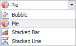
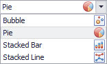
Use the ImageComboBoxItem.ImageIndex property to assign an image to an item. The GlyphAlignment property specifies the image alignment.
HorzAlignment value | Image |
|---|---|
| |
The edit box does not display the selected item’s text. Item images are left-aligned in the dropdown. | |
|
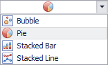
If the image is aligned at the center, the item caption (see ImageComboBoxItem.Description) is hidden in the edit box. However, if the ImageComboBoxEdit control is used to edit a column in a Grid, Vertical Grid, Tree List, or Search Lookup Editor control, the Find Panel still finds the hidden captions.
Related GitHub Examples
The following code snippets (auto-collected from DevExpress Examples) contain references to the GlyphAlignment property.
Note
The algorithm used to collect these code examples remains a work in progress. Accordingly, the links and snippets below may produce inaccurate results. If you encounter an issue with code examples below, please use the feedback form on this page to report the issue.