RepositoryItemDateEdit.CalendarView Property
Gets or sets the appearance of the DateEdit control’s dropdown calendar.
Namespace: DevExpress.XtraEditors.Repository
Assembly: DevExpress.XtraEditors.v18.2.dll
Declaration
[DefaultValue(CalendarView.Default)]
[SmartTagProperty("Calendar View", "", SmartTagActionType.RefreshAfterExecute)]
[DXCategory("Appearance")]
public CalendarView CalendarView { get; set; }Property Value
| Type | Default | Description |
|---|---|---|
| CalendarView | **Default** | A CalendarView value that specifies how a date value is edited via the control’s dropdown window. |
Available values:
| Name | Description |
|---|---|
| Default | The appearance of the calendar is dependent on the current OS. |
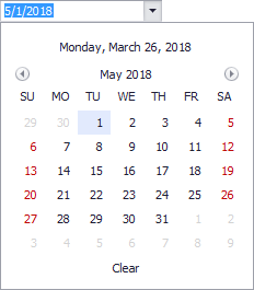
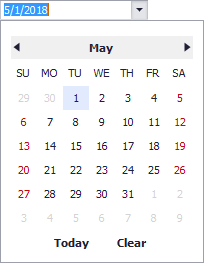
| Vista | The Vista-style calendar:
|
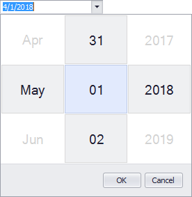
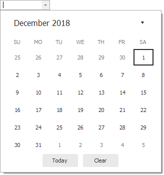
| Classic | The classic calendar:
|
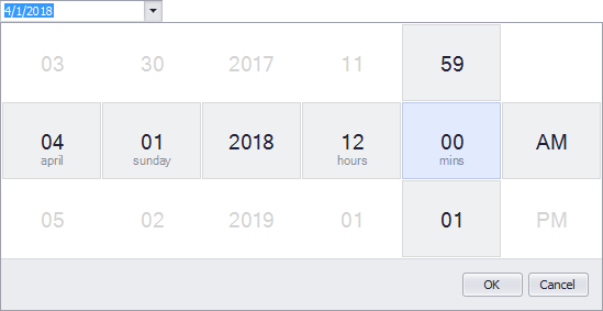
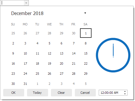
| TouchUI | The touch-aware date-editing UI:
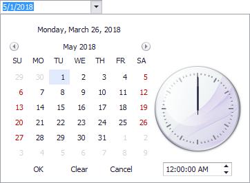
For a DateEdit control, the control’s mask (see the RepositoryItemTextEdit.Mask inherited property) specifies which date-time columns are displayed in the dropdown calendar. To display time columns, enable the RepositoryItemDateEdit.CalendarTimeEditing option. |
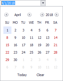
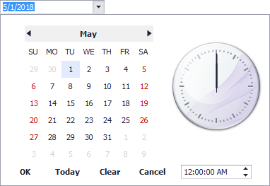
| ClassicNew | An Outlook 2016-inspired calendar style.
|
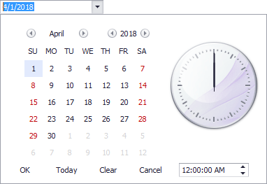
| Fluent | The calendar that supports the Acrylic and Reveal Highlight effects and allows you to mirror the appearance of the Windows 10 calendar.
|
Remarks
The CalendarView property specifies the appearance of the DateEdit control’s dropdown calendar.
To allow end-users to edit the time portion of a date value via the calendar, use the RepositoryItemDateEdit.CalendarTimeEditing property.