BaseRepositoryItemCheckEdit.GlyphAlignment Property
Gets or sets the horizontal alignment of a check box glyph within a check editor.
Namespace: DevExpress.XtraEditors.Repository
Assembly: DevExpress.XtraEditors.v18.2.dll
Declaration
[DXCategory("Behavior")]
[SmartTagProperty("GlyphAlignment", "", SmartTagActionType.RefreshBoundsAfterExecute)]
public virtual HorzAlignment GlyphAlignment { get; set; }Property Value
| Type | Description |
|---|---|
| HorzAlignment | A DevExpress.Utils.HorzAlignment enumeration value specifying the check box’s horizontal alignment. |
Available values:
| Name | Description |
|---|---|
| Default | Places an object or text at the default position, which is determined by a control. |
| Near | Places an object/text at a near position. |
| Center | Centers an object or text within a region. |
| Far | Places an object/text at a far position. |
Remarks
Use the GlyphAlignment property to specify the horizontal alignment of the glyph representing a check box within a check editor. This property also affects the editor’s caption text alignment. If the GlyphAlignment property is set to Center, the caption text is hidden and only the check box is displayed.
Assigning a new value for the GlyphAlignment property at runtime generates the RepositoryItem.PropertiesChanged event.
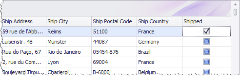
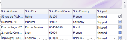
The following images demonstrate the check box aligned to the center and to the right respectively.
You can also specify the vertical alignment of the glyph using the BaseRepositoryItemCheckEdit.GlyphVAlignment property.
Related GitHub Examples
The following code snippets (auto-collected from DevExpress Examples) contain references to the GlyphAlignment property.
Note
The algorithm used to collect these code examples remains a work in progress. Accordingly, the links and snippets below may produce inaccurate results. If you encounter an issue with code examples below, please use the feedback form on this page to report the issue.