PopupGalleryEdit Class
The editor that displays a dropdown gallery of items categorized into groups.
Namespace: DevExpress.XtraEditors
Assembly: DevExpress.XtraBars.v23.2.dll
NuGet Package: DevExpress.Win.Navigation
Declaration
Remarks
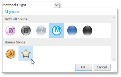
The PopupGalleryEdit displays a dropdown gallery (RepositoryItemPopupGalleryEdit.Gallery), where items can be combined into groups:
General information on galleries, items and gallery initialization can be found in the following topics.
Online Video
DevExpress WinForms: PopUp Gallery.
Concepts
One or more items can be selected (checked) simultaneously in the dropdown gallery. This behavior is controlled by the BaseGallery.ItemCheckMode property of the embedded gallery (RepositoryItemPopupGalleryEdit.Gallery).
The editor’s edit value is created according to the RepositoryItemPopupGalleryEdit.EditValueType property. If this property is set to CSV, the edit value is a string concatenating values of currently selected gallery items (GalleryItem.Value). Each gallery item value is converted to a string during the concatenation. Individual values are separated in the result string with a specific separator (RepositoryItemPopupGalleryEdit.SeparatorChar) and a space character.
If the RepositoryItemPopupGalleryEdit.EditValueType property is set to List, the editor’s edit value is a list (List<object>) containing selected gallery item values as its elements.
Note
Ensure that all your gallery items have their Value property specified. Items with empty values may raise exceptions when selected at runtime.
The control’s display text (the text painted within the edit box) is also specified by the items that are selected in the dropdown gallery. If a single gallery item is selected, the control’s edit box displays this item’s GalleryItem.Caption. If multiple gallery items are selected, the edit box displays their captions, separated by the separator (RepositoryItemPopupGalleryEdit.SeparatorChar) and a space character.

Handle the RepositoryItemPopupGalleryEdit.QueryDisplayText event to customize the control’s display text.
Design-Time Example
To populate a PopupGalleryEdit‘s gallery with items, click the control’s smart-tag and select ‘Edit Gallery’.

In the gallery designer, click the ‘Add Group’ or ‘Add Item’ button to add a new group (a GalleryItemGroup object) or item (a GalleryItem object) respectively.

The ‘Generate Values’ button automatically sets numeric values for all items whose GalleryItem.Value properties were not specified.
Runtime Example
The following example shows how to initialize the PopupGalleryEdit‘s gallery at runtime.
First, a PopupGalleryEditGallery object is created and populated with groups and items. Then, the Assign method is called to copy these items from the created gallery into the gallery associated with the target PopupGalleryEdit control.
PopupGalleryEditGallery inplaceGallery = new PopupGalleryEditGallery() {ImageSize = new System.Drawing.Size(32, 32)};
GalleryItemGroup group1 = new GalleryItemGroup() { Caption="Group 1" };
GalleryItem item1 = new GalleryItem() {
    Caption = "Item 1",
    Image = global::draft_gallery.Properties.Resources.cancel_32x32
};
GalleryItem item2 = new GalleryItem() {
    Caption = "Item 2",
    Image = global::draft_gallery.Properties.Resources.apply_32x32
};
group1.Items.AddRange(new GalleryItem[] { item1, item2 });
inplaceGallery.Groups.Add(group1);
popupGalleryEdit1.Properties.Gallery.Assign(inplaceGallery);
See Gallery Controls to learn more about the controls that support galleries.