LabelControl Class
The label that supports formatted text, images, multi-line text strings and HTML formatting.
Namespace: DevExpress.XtraEditors
Assembly: DevExpress.XtraEditors.v18.2.dll
Declaration
[SmartTagFilter(typeof(LabelControlFilter))]
[ToolboxBitmap(typeof(ToolboxIconsRootNS), "LabelControl")]
public class LabelControl :
    BaseStyleControl,
    IMouseWheelSupportIgnore,
    ISupportCommandBinding,
    ISupportImageDragDrop,
IImageDropInfoRelated API Members
The following members return LabelControl objects:
Remarks
Labels are used to provide descriptive text or other helpful information. Use the Text property to specify the label’s text. You can provide either plain or formatted text (see LabelControl.AllowHtmlString).
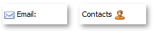
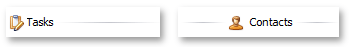
A LabelControl can display an image (regular or animated GIF file). Different images can be provided in the normal, disabled, hovered and pressed states. To specify images, use the label’s appearance settings, accessed via the LabelControl.Appearance, LabelControl.AppearanceDisabled, LabelControl.AppearanceHovered and LabelControl.AppearancePressed properties. For instance, use the LabelControl.Appearance.Image or LabelControl.Appearance.ImageIndex (LabelControlAppearanceObject.ImageIndex) property to provide the default image for the label.
The alignment of an image relative to the label’s text is specified by the LabelControl.ImageAlignToText property.
If the LabelControl.ImageAlignToText property is set to ImageAlignToText.None, the alignment of an image within the label is specified by the label’s appearance settings (LabelControlAppearanceObject.ImageAlign).
When the LabelControl.LineVisible property is set to true, a LabelControl displays a line in its empty space.
The properties that affect the line display include:
The line is displayed when the label’s width/height exceeds the width/height of its text. In some cases, you may need to manipulate the LabelControl.AutoSizeMode property to resize a label to custom dimensions.
A LabelControl participates in the tab order of a form, but does not receive focus (the next control in the tab order receives focus). For instance, if the LabelControl.UseMnemonic property is set to true, and a mnemonic character - the first character after an ampersand (&) - is specified in the label’s Text property, when a user presses ALT+ the mnemonic key, focus moves to the next control in the tab order. This feature provides keyboard navigation for a form.
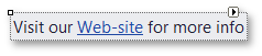
A LabelControl can display a hyperlink. To do so, set the LabelControl.AllowHtmlString property to true and format the required text with the <href></href> tag, as shown below.
myLabelControl.AllowHtmlString = true;
myLabelControl.Text = "Visit our <href="www.devexpress.com">Web-site</href>";
When an end-user clicks the hyperlink, the LabelControl.HyperlinkClick event occurs. Handle it to perform specific operations, depending on the link.
To format text using HTML syntax in cells in container controls (e.g., Data Grid, Tree List, etc.), use the RepositoryItemHypertextLabel in-place editor.
Related GitHub Examples
The following code snippet (auto-collected from DevExpress Examples) contains a reference to the LabelControl class.
Note
The algorithm used to collect these code examples remains a work in progress. Accordingly, the links and snippets below may produce inaccurate results. If you encounter an issue with code examples below, please use the feedback form on this page to report the issue.