GroupControl.GroupStyle Property
Gets or sets the style of this GroupControl‘s borders and header.
Namespace: DevExpress.XtraEditors
Assembly: DevExpress.Utils.v19.1.dll
Declaration
[DXCategory("Appearance")]
[DefaultValue(GroupStyle.Inherited)]
[SmartTagProperty("Group Style", "")]
public virtual GroupStyle GroupStyle { get; set; }Property Value
| Type | Default | Description |
|---|---|---|
| DevExpress.Utils.GroupStyle | **Inherited** | A DevExpress.Utils.GroupStyle object enumeration value that specifies the style of this GroupControl‘s borders and header. |
Remarks
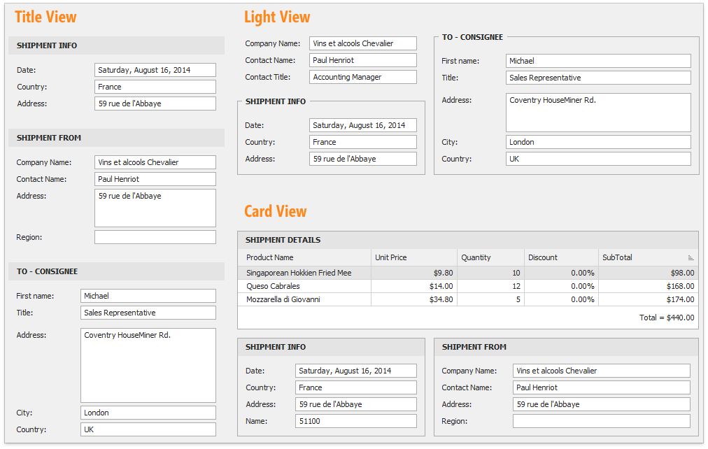
The GroupStyle property allows you to select from the following group styles:
- Card View - old-school group style with solid borders and designated header area;
- Light View - groups with this style applied have captions embedded into group borders;
- Title View - a style for groups with no borders.
If the GroupStyle property equals GroupStyle.Inherited, the group style depends on the currently applied skin.
See Also