GroupControl.CustomHeaderButtons Property
Provides access to the custom header buttons’ collection.
Namespace: DevExpress.XtraEditors
Assembly: DevExpress.Utils.v19.1.dll
Declaration
[ListBindable(false)]
[DXCategory("Custom Header Buttons")]
public virtual BaseButtonCollection CustomHeaderButtons { get; }Property Value
| Type | Description |
|---|---|
| DevExpress.XtraEditors.ButtonPanel.BaseButtonCollection | A DevExpress.XtraEditors.ButtonPanel.BaseButtonCollection object that stores custom header buttons for this GroupControl. |
Remarks
Custom header buttons are buttons displayed in the GroupControl header. To add these buttons at design-time, use the corresponding link in the GroupControl‘s smart-tag, as the following figure shows.
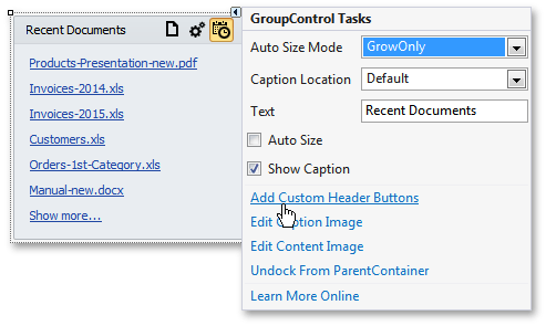
As you click the link, the Custom Header Buttons Editor appears. Here you can add new or re-arrange/remove existing custom buttons.
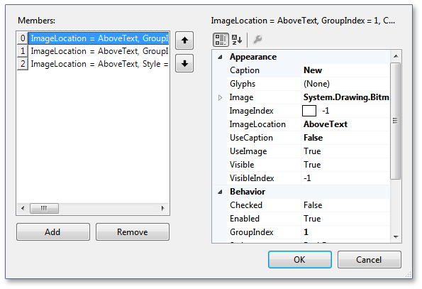
Custom header buttons can be of two types - regular push or check buttons. To specify the button type, use its Style property. Each button also has a set of properties that manage its appearance - Caption, UseCaption, Image, ImageLocation etc. The GroupControl’s GroupControl.CustomHeaderButtonsLocation property is a global setting that affects all buttons owned by this control.
To respond to end-users clicking custom header buttons, handle the GroupControl.CustomButtonClick and GroupControl.CustomButtonChecked/GroupControl.CustomButtonUnchecked events.
Note
Custom header buttons are displayed within the control’s header. The header’s visibility is determined by the GroupControl.ShowCaption and PanelControl.BorderStyle properties. It’s hidden if the GroupControl.ShowCaption property is set to false, or the PanelControl.BorderStyle property is set to NoBorder.