FormatConditionRuleIconSet Class
Applies a format using an icon set.
Namespace: DevExpress.XtraEditors
Assembly: DevExpress.XtraEditors.v23.2.dll
NuGet Package: DevExpress.Win.Navigation
Declaration
public class FormatConditionRuleIconSet :
    FormatConditionRuleBase,
    IFormatRuleDraw,
    IFormatRuleContextImage,
    IFormatConditionRuleIconSet,
IFormatConditionRuleBaseRemarks
An icon set format allows you to classify column values into several ranges separated by threshold values, and display a specific icon in a column cell according to the range to which this cell value belongs. The number of elements in the icon set corresponds to the number of ranges.
The following image shows properties of a sample FormatConditionRuleIconSet object. It defines three icons, and thus, three ranges. An upward green triangle corresponds to positive values, a downward red triangle corresponds to negative values and an yellow dash icon corresponds to values equal to zero.

The FormatConditionRuleIconSet.IconSet property of the FormatConditionRuleIconSet object specifies an icon set and additional settings for the conditional formatting rule. (When initializing the FormatConditionRuleIconSet object in code, the FormatConditionRuleIconSet.IconSet property is set to null; use a FormatConditionIconSet object to initialize this property). The IconSet property provides access to the FormatConditionIconSet.Icons collection which stores icons (FormatConditionIconSetIcon objects).
To specify ranges to which icons correspond, set threshold values and comparison operators using the FormatConditionIconSetIcon.Value and FormatConditionIconSetIcon.ValueComparison properties. In addition, utilize the icon set’s FormatConditionIconSet.ValueType property to specify the type of threshold values (numeric or percentage) for all icons within the current icon set.
For each FormatConditionIconSetIcon object, you can select one of the predefined icons using the PredefinedName property or apply a custom icon using the Icon property.
The images below demonstrate examples of applying a FormatConditionRuleIconSet format.


See the following documents to learn more.
- GridControl: Conditional Formatting.
- PivotGridControl: Conditional Formatting.
- TreeList: Conditional Formatting.
Example
This example illustrates how to apply an icon set format to the Satisfaction column in a GridControl at design time using the Grid Designer and in code.
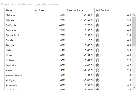
An icon set format allows you to classify column cell values into several ranges, assign an icon to each range, and display a specific icon in a cell according to the cell value. In this example, a predefined icon set is used to display empty, half-filled and filled star icons for small (from 0% to 33%), middle (from 33% to 67%) and large (more than 67%) values, respectively.
To create a new formatting rule at design time, invoke the Format Rule Collection Editor from the Grid Designer. It can also be accessed from the Properties grid by clicking the ellipsis button for the ColumnView.FormatRules property.
Invoke the Grid Designer and switch to the Style Format Rules page (in the Appearance category).

- Click the Add button
 to create a new format rule (format rules in a GridControl are encapsulated by GridFormatRule objects).
 Select the Format using icons rule type. The format rule’s FormatRuleBase.Rule property will be set to a new
FormatConditionRuleIconSetobject.
Set the GridFormatRule.Column property to the Satisfaction column. This column provides values to test against the formatting rule.

By default, this property also specifies the column to which formatting is applied. If required, you can apply formatting to another column by setting the GridFormatRule.ColumnApplyTo property.
Choose one of the predefined icon sets using the FormatConditionRuleIconSet.IconSet property. You can do this in the Properties tab or the Rule tab. The Rule tab allows you to see a preview of the selected icon set. In this example, the Ratings: Stars3 icon set is selected.

When choosing this predefined icon set (or any other predefined icon set), FormatConditionIconSetIcon objects are added to the IconSet.Icons collection. They refer to certain predefined icons via the PredefinedName property. You can change a specific icon to another predefined icon using the PredefinedName property, or to a custom icon using the Icon property.

In addition, threshold values, comparison operators and value type are automatically set according to the selected icon set. You can change these options to custom values using the FormatConditionIconSetIcon.Value, FormatConditionIconSetIcon.ValueComparison and FormatConditionIconSet.ValueType properties.
Run the application. The image below illustrates the result.
The following code is equivalent to the design-time actions shown above.
using DevExpress.XtraGrid;
using DevExpress.XtraEditors;

GridFormatRule gridFormatRule = new GridFormatRule();
FormatConditionRuleIconSet formatConditionRuleIconSet = new FormatConditionRuleIconSet();
FormatConditionIconSet iconSet = formatConditionRuleIconSet.IconSet = new FormatConditionIconSet();
FormatConditionIconSetIcon icon1 = new FormatConditionIconSetIcon();
FormatConditionIconSetIcon icon2 = new FormatConditionIconSetIcon();
FormatConditionIconSetIcon icon3 = new FormatConditionIconSetIcon();

//Choose predefined icons.
icon1.PredefinedName = "Stars3_1.png";
icon2.PredefinedName = "Stars3_2.png";
icon3.PredefinedName = "Stars3_3.png";

//Specify the type of threshold values.
iconSet.ValueType = FormatConditionValueType.Percent;

//Define ranges to which icons are applied by setting threshold values.
icon1.Value = 67; // target range: 67% <= value
icon1.ValueComparison = FormatConditionComparisonType.GreaterOrEqual;
icon2.Value = 33; // target range: 33% <= value < 67%
icon2.ValueComparison = FormatConditionComparisonType.GreaterOrEqual;
icon3.Value = 0; // target range: 0% <= value < 33%
icon3.ValueComparison = FormatConditionComparisonType.GreaterOrEqual;

//Add icons to the icon set.
iconSet.Icons.Add(icon1);
iconSet.Icons.Add(icon2);
iconSet.Icons.Add(icon3);

//Specify the rule type.
gridFormatRule.Rule = formatConditionRuleIconSet;
//Specify the column to which formatting is applied.
gridFormatRule.Column = colCustomersSatisfaction;
//Add the formatting rule to the GridView.
gridView1.FormatRules.Add(gridFormatRule);