FormatConditionRuleDataBar Class
Applies a format using a data bar.
Namespace: DevExpress.XtraEditors
Assembly: DevExpress.XtraEditors.v18.2.dll
Declaration
public class FormatConditionRuleDataBar :
    FormatConditionRuleMinMaxBase,
    IAppearanceOwner,
    IFormatRuleDraw,
    IFormatConditionRuleDataBar,
    IFormatConditionRuleBase,
IFormatConditionRuleMinMaxBaseRemarks
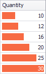
A data bar allows you to see a cell value relative to other cells. The bar length changes proportionally to a cell value. A longer bar corresponds to a higher value, and a shorter bar corresponds to a lower value.
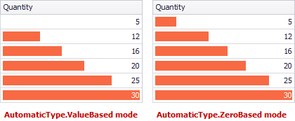
By default, the FormatConditionRuleMinMaxBase.MinimumType and FormatConditionRuleMinMaxBase.MaximumType properties are set to Automatic, and thus, the bar’s minimum and maximum values are calculated automatically, by iterating through column values. The FormatConditionRuleMinMaxBase.AutomaticType setting allows you to choose the formula to calculate automatic minimum and maximum bar values.
You can manually specify the values to regard as the minimum and maximum. To do this, set the MinimumType/MaximumType properties to Number or Percent and specify the values using the FormatConditionRuleMinMaxBase.Minimum and FormatConditionRuleMinMaxBase.Maximum properties.
You can specify format appearance settings with the FormatConditionRuleDataBar.PredefinedName property, which allows you to choose one of the predefined style formats. To provide custom appearance settings for data bars (background color, border color, foreground color, gradient mode, etc.), utilize the FormatConditionRuleDataBar.Appearance property. If column cells contain negative values, you can provide appearance settings for negative bars using the FormatConditionRuleDataBar.AppearanceNegative property.
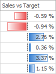
To display negative bars in the same direction as positive bars, set the FormatConditionRuleDataBar.AllowNegativeAxis property to false (the FormatConditionRuleDataBar.AppearanceNegative property is ignored in this case). To customize the visibility and position of the vertical axis between negative and positive data bars, utilize the FormatConditionRuleDataBar.DrawAxis and FormatConditionRuleDataBar.DrawAxisAtMiddle properties.
The FormatConditionRuleDataBar.RightToLeft property allows you to choose between left-to-right and right-to-left bar directions. You can select whether to show values in the cells after applying a format using the FormatConditionRuleDataBar.ShowBarOnly property.
See the following documents to learn more.
- GridControl: Conditional Formatting.
- PivotGridControl: Conditional Formatting.
- TreeList: Conditional Formatting.
Example
This example illustrates how to apply a data bar format to the Unit Price column in a GridControl at design time and in code.
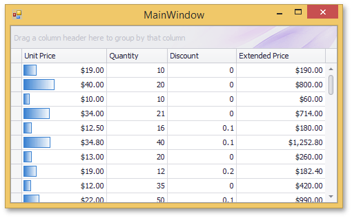
Data bars fill column cells proportionally based on cell values relative to other cells. A longer bar corresponds to a higher value, and a shorter bar corresponds to a lower value.
To create a new formatting rule at design time, invoke the Format Rule Collection Editor from the Grid Designer. It can also be accessed from the Properties grid by clicking the ellipsis button for the ColumnView.FormatRules property.
Invoke the Grid Designer and switch to the Style Format Rules page (in the Appearance category).
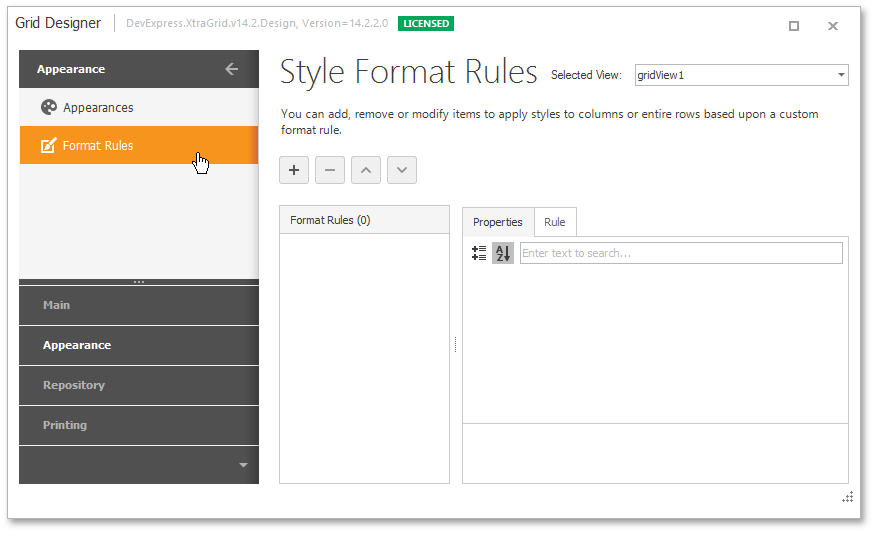
- Click the Add button
 to create a new format rule (format rules in a GridControl are encapsulated by GridFormatRule objects).
 Select the Format using Data bar rule type. The format rule’s FormatRuleBase.Rule property will be set to a new
FormatConditionRuleDataBarobject.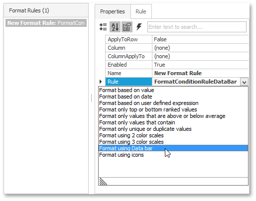
Set the GridFormatRule.Column property to the Unit Price column. This column provides values to test against the formatting rule.
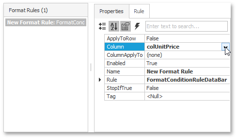
By default, the format is applied to the Unit Price column. However, you can apply this format to another column by setting the GridFormatRule.ColumnApplyTo property.
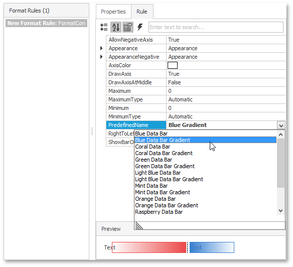
Choose one of the predefined bars styles using the FormatConditionRuleDataBar.PredefinedName property. You can do this in the Properties tab or the Rule tab. Additionally, the Rule tab allows you to see a preview of the selected style. In this example, the Blue Data Bar Gradient style is selected.
You can also provide a custom bar style using the FormatConditionRuleDataBar.Appearance and FormatConditionRuleDataBar.AppearanceNegative properties.
By default, the FormatConditionRuleMinMaxBase.MinimumType and FormatConditionRuleMinMaxBase.MaximumType properties are set to Automatic. This means that the minimum and maximum values for applying the format are calculated automatically. You can also specify values to be considered minimum and maximum using the FormatConditionRuleMinMaxBase.Minimum and FormatConditionRuleMinMaxBase.Maximum properties (the MinimumType/MaximumType properties should be set to Number or Percent).
Run the application. The image below illustrates the result.
The following code is equivalent to the design-time actions shown above.
using DevExpress.XtraEditors;
using DevExpress.XtraGrid;

GridFormatRule gridFormatRule = new GridFormatRule();
FormatConditionRuleDataBar formatConditionRuleDataBar = new FormatConditionRuleDataBar();
gridFormatRule.Column = this.colUnitPrice;
formatConditionRuleDataBar.PredefinedName = "Blue Gradient";
gridFormatRule.Rule = formatConditionRuleDataBar;
this.gridView.FormatRules.Add(gridFormatRule);