DateEdit Class
The editor with a dropdown calendar to display and edit date/time values.
Namespace: DevExpress.XtraEditors
Assembly: DevExpress.XtraEditors.v23.2.dll
NuGet Package: DevExpress.Win.Navigation
Declaration
[DefaultBindingPropertyEx("DateTime")]
public class DateEdit :
    PopupBaseEdit,
IDateRangeCollectionOwnerRemarks
The DateEdit control allows you to display and edit date/time values. Users can type within the edit box or select the date from the dropdown calendar.
Edit Value
Use the DateTime or EditValue property to specify the editor’s value.
Calendar Views and Styles
Use the Properties.CalendarView property to specify a calendar view/style. Available views include:
| Calendar Style | Description |
|---|---|
| Fluent | The calendar that supports the Acrylic and Reveal Highlight effects and allows you to mirror the appearance of the Windows 10 calendar.
|
| Vista | Vista-style Calendar |
| TouchUI | The touch-aware date-editing UI:
For a DateEdit control, the control’s mask (see the RepositoryItemTextEdit.Mask inherited property) specifies which date-time columns are displayed in the dropdown calendar. To display time columns, enable the RepositoryItemDateEdit.CalendarTimeEditing option. |
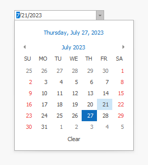
| Classic | The classic calendar:
|
| ClassicNew | An Outlook 2016-inspired calendar style.
|
In Vista view, use the VistaCalendarViewStyle property to specify which date-grouping views are available to users.
dateEdit1.Properties.Mask.EditMask = "Y";
dateEdit1.Properties.Mask.UseMaskAsDisplayFormat = true;
dateEdit1.Properties.VistaCalendarViewStyle = DevExpress.XtraEditors.VistaCalendarViewStyle.YearView;

Main Settings and Events
Use the DateEdit.Properties property to customize DateEdit specific settings.

General settings include:
- ShowToday - Gets or sets whether to display the Today button in the dropdown calendar (in Classic and Vista modes).
- ShowClear - Gets or sets whether the dropdown calendar contains the Clear button (this button is not supported in CalendarView.TouchUI mode).
- AllowNullInput - Gets or sets whether end users can reset the editor’s value to null with the keyboard.
- CalendarTimeEditing - Gets or sets whether an end-user can edit the time portion of a date value in the dropdown calendar.
- DrawItem (DateEdit.DrawItem) - Allows you to paint day cells in the dropdown calendar.
- DisableCalendarDate ( DisabledDateProvider ) - Allows you to disable specific dates.
- MinValue / MaxValue - Specify the allowed range of dates.
Masked Input
By default, DateEdit functions in the DateTime masked mode, which allows you to enter date/time values using one of the standard or custom date/time patterns.
Use the RepositoryItemDateEdit.EditMask property to switch from the default pattern (short date -“d”) to another one.
Set the MaskProperties.MaskType (DateEdit.Properties.Mask.MaskType) property to DateTimeAdvancingCaret to allow the caret to automatically skip date separators while entering date/time values.
Note
The date/time masks only support the following calendars: Gregorian, Korean, Taiwan, and Thai Buddhist.
Date Range Selection
Set the SelectionMode property to CalendarSelectionMode.Multiple to allow users to select multiple dates. Use the SelectedRanges property to obtain the selected date range.

dateEditSample.Properties.SelectionMode = DevExpress.XtraEditors.CalendarSelectionMode.Multiple;
DateRangeCollection selectedDates = dateEditSample.SelectedRanges;
Bind to Data Source
If you need to bind the DateEdit control to a field in an underlying data source/business object, we recommend that this field stores date/time values.
If the DateEdit is bound to a string field, the editor value is updated according to the current culture. For instance, day and month date portions can swap places. In this case, you need to manually parse editor values:
Enter Date-Time Values
See the following topic to learn about the editors you can use to enter date-time values: How to: Enter date-time values.