ImageSlider.ContextButtons Property
Provides access to the collection of context buttons displayed in the image slider.
Namespace: DevExpress.XtraEditors.Controls
Assembly: DevExpress.XtraEditors.v19.2.dll
Declaration
Property Value
| Type | Description |
|---|---|
| DevExpress.Utils.ContextItemCollection | A ContextItemCollection object that represents the collection of context buttons displayed in the image slider. |
Remarks
The ContextButtons property provides access to the collection of context buttons that are displayed in the ImageSlider. For details, see the ContextItem class, which is the base class for the context buttons.
The figure below shows the ImageSlider control that displays the context buttons.

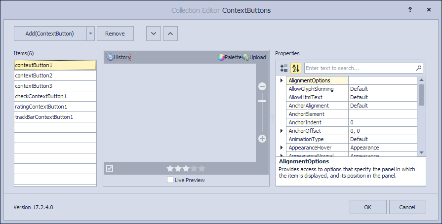
At design time, you can manage the context button collection and specify button properties using the Context Buttons designer. To invoke this designer, click the ellipsis button of the ContextButtons property in the Properties window. See the figure below.
To respond to clicks on context buttons in a centralized way, handle the ImageSlider.ContextButtonClick event. The Item property of the ContextItemClickEventArgs object passed to the event handler as a parameter, allows you to determine the button being clicked.
The ImageSlider.ContextButtonOptions property provides access to the settings applied to the context buttons and the panels that contain them. For instance, you can specify the indent between the buttons, the background color of each panel, animation used to show and hide the panels, and the padding around the buttons.