CalendarControl Class
Displays a monthly calendar and allows an end-user to select a date or date range(s).
Namespace: DevExpress.XtraEditors.Controls
Assembly: DevExpress.XtraEditors.v23.2.dll
NuGet Package: DevExpress.Win.Navigation
Declaration
public class CalendarControl :
    CalendarControlBase,
    IDateTouchCalendarControl,
    ITouchCalendarControl,
    IPickItemsContainer,
IMouseWheelSupportRemarks
The calendar control displays one or multiple months simultaneously. An end-user can select a certain date, a date range or multiple dates/date ranges.
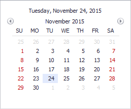
To access selected dates, use the following properties:
- CalendarControlBase.EditValue (in single selection mode).
- CalendarControlBase.SelectedRanges (in multiple selection mode).
The control’s main features include:

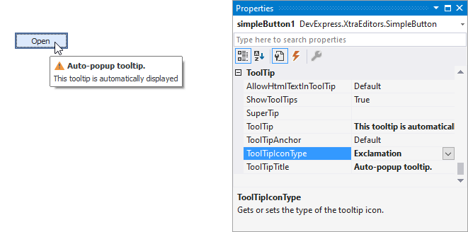
Tooltips
DevExpress controls support regular and super tooltips. If the ShowToolTips option is enabled, tooltips are shown when the mouse pointer hovers over the control.
Use the following properties to specify a regular tooltip’s content:
- ToolTip — A regular tooltip’s text. If the text is not specified, the tooltip is not displayed even if the title is specified. You can use line breaks in regular tooltips. Use the AllowHtmlTextInToolTip property to specify whether to parse HTML tags in the text. HTML tags allow you to format the text: size, style, hyperlinks, etc.
- ToolTipTitle — A regular tooltip’s title. If the title is not specified, it is not displayed.
ToolTipIconType — A regular tooltip’s predefined icon. Use the controller’s IconSize property to specify the image size.
To display a custom image in all regular tooltips, use the controller’s ImageList and ImageIndex properties.
To display a custom image in a specific regular tooltip, handle the BeforeShow event. Use the ImageOptions event argument to assign a raster or vector image to the processed tooltip.
Use the SuperTip property to assign a super tooltip to a control. Enable the AllowHtmlText property to use HTML tags in the super tooltip.
To replace regular tooltips with super tooltips, set the ToolTipController.ToolTipType property to SuperTip. The controller automatically converts regular tooltips to super tooltips. To access this property, you can use the DefaultToolTipController component or a custom controller assigned to the ToolTipController property. See the following topic for more information: Hints and Tooltips.