ButtonEdit Class
The text editor that displays buttons in the edit box.
Namespace: DevExpress.XtraEditors
Assembly: DevExpress.XtraEditors.v23.2.dll
NuGet Package: DevExpress.Win.Navigation
Declaration
Related API Members
The following members return ButtonEdit objects:
Remarks
The ButtonEdit control is a text editor (a TextEdit descendant) that allows you to display one or more buttons in the edit box.
You can embed a ButtonEdit control in a container control (for instance, GridControl, TreeList, RibbonControl) to display/edit data in this container’s cell or item. Use a RepositoryItemButtonEdit object to create an in-place editor.
Access the Edit Value and Bind to a Data Source
Use the ButtonEdit.Text or ButtonEdit.EditValue property to access or set a standalone editor’s text.
The ButtonEdit.Text and ButtonEdit.EditValue properties allow you to bind an editor to a data source.

buttonEdit1.DataBindings.Add(new System.Windows.Forms.Binding("EditValue", this.carsBindingSource, "Description", true));
Handle the ButtonEdit.EditValueChanged/ButtonEdit.Properties.EditValueChanged or inherited TextChanged event to respond to text changes.
Customize ButtonEdit Settings
Use the ButtonEdit.Properties object to access and customize the control’s settings.

The main settings include:
- Properties.Buttons—Returns the collection of buttons in the current button editor.
- Properties.MaskSettings—Provides access to settings that allow you to create input masks. This property replaces the Mask property beginning with v20.2. See the following help topic for more information: Input Masks.
Properties.TextEditStyle—This property allows you to choose the editor’s display mode:
- Standard—The editor functions normally.
HideTextEditor—The editor hides the edit box and only displays buttons.

DisableTextEditor—Text edit and selection operations are not allowed.

Add Buttons and Respond to Button Clicks
Use the Properties.Buttons collection to add buttons to standalone editors.


Each button (an EditorButton object) exposes properties to specify image options (ImageOptions), button kind (Kind), caption (Caption), tooltip (ToolTip, SuperTip), enabled state, appearance settings, etc.
Handle the following events to perform actions when a user clicks an embedded button:
- ButtonEdit.ButtonClick/ButtonEdit.Properties.ButtonClick
- ButtonEdit.ButtonPressed/ButtonEdit.Properties.ButtonPressed
Example - Create Standalone Button Editor
The following code creates a ButtonEdit control and places it onto a panel:
The code changes the button collection as follows:
- Changes the default button glyph (ellipsis) into
 (ButtonPredefines.OK).
 - Adds a button that displays the
 glyph (ButtonPredefines.Delete).
The example subscribes to the ButtonEdit.ButtonClick event to respond to button clicks.

ButtonEdit btnEdit1 = new ButtonEdit();
btnEdit1.Width = 100;
btnEdit1.Properties.Buttons[0].Kind = ButtonPredefines.OK;
btnEdit1.Properties.Buttons.Add(new EditorButton(ButtonPredefines.Delete));
panel1.Controls.Add(btnEdit1);

btnEdit1.ButtonClick += BtnEdit1_ButtonClick;

private void BtnEdit1_ButtonClick(object sender, ButtonPressedEventArgs e) {
    ButtonEdit editor = sender as ButtonEdit;
    if(e.Button.Kind == ButtonPredefines.OK) {
        //...
    }
    if (e.Button.Kind == ButtonPredefines.Delete) {
        //...
    }
}
Example - Create In-place Button Editor
The following example embeds an in-place ButtonEdit editor (a RepositoryItemButtonEdit object) into a Data Grid’s “Description” column.
The example creates two buttons (Undo and Copy) for the editor and handles the RepositoryItemButtonEdit.ButtonClick event to perform actions when a user clicks any of these buttons.

RepositoryItemButtonEdit inplaceButtonEdit = new RepositoryItemButtonEdit();
inplaceButtonEdit.Buttons.Clear();
//Undo Button
EditorButton undoButton = new EditorButton(ButtonPredefines.Undo);
undoButton.Enabled = false;
//Copy Button
EditorButton copyButton = new EditorButton(ButtonPredefines.Glyph);
copyButton.Caption = "Copy";
copyButton.ImageOptions.SvgImage = global::WindowsFormsApplication2.Properties.Resources.copy;
copyButton.ImageOptions.SvgImageSize = new Size(16, 16);

inplaceButtonEdit.Buttons.Add(undoButton);
inplaceButtonEdit.Buttons.Add(copyButton);
inplaceButtonEdit.ButtonClick += InplaceButtonEdit_ButtonClick;
inplaceButtonEdit.EditValueChanged += InplaceButtonEdit_EditValueChanged;
gridView1.Columns["Description"].ColumnEdit = inplaceButtonEdit;
gridView1.GridControl.RepositoryItems.Add(inplaceButtonEdit);


private void InplaceButtonEdit_ButtonClick(object sender, ButtonPressedEventArgs e) {
    ButtonEdit editor = sender as ButtonEdit;
    if (e.Button.Kind == ButtonPredefines.Undo) {
        editor.Undo();
    }
    if (e.Button.Kind == ButtonPredefines.Glyph && e.Button.Caption == "Copy") {
        editor.SelectAll();
        editor.Copy();
    }
}

private void InplaceButtonEdit_EditValueChanged(object sender, EventArgs e) {
    ButtonEdit editor = sender as ButtonEdit;
    if (editor.Properties.Buttons.Count == 0) return;
    EditorButton undoButton = editor.Properties.Buttons[0];
    if ( undoButton.Kind == ButtonPredefines.Undo) {
        undoButton.Enabled = editor.CanUndo;
    }
}
Example - Create Button with Custom Image
using System;
using System.Drawing;
using DevExpress.XtraEditors.Controls;

// Creates a button and sets its Kind property to 'ButtonPredefines.Glyph' to display a custom image.
EditorButton customButton = new EditorButton(ButtonPredefines.Glyph);
// Specifies an SVG image.
customButton.ImageOptions.SvgImage = svgImageCollection1[0];
// Sets the image size.
customButton.ImageOptions.SvgImageSize = new Size(16, 16);
// Adds the button to the Button Editor's 'Properties.Buttons' collection.
buttonEdit1.Properties.Buttons.Add(customButton);
The following screenshots shows the result:

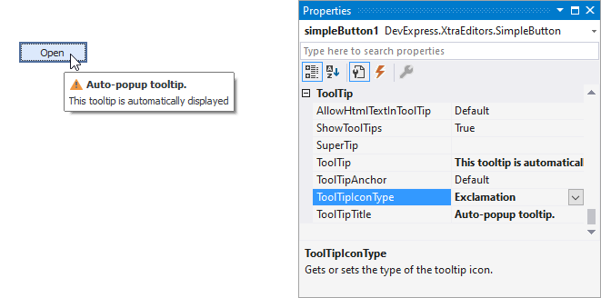
Tooltips
DevExpress controls support regular and super tooltips. If the ShowToolTips option is enabled, tooltips are shown when the mouse pointer hovers over the control.
Use the following properties to specify a regular tooltip’s content:
- ToolTip — A regular tooltip’s text. If the text is not specified, the tooltip is not displayed even if the title is specified. You can use line breaks in regular tooltips. Use the AllowHtmlTextInToolTip property to specify whether to parse HTML tags in the text. HTML tags allow you to format the text: size, style, hyperlinks, etc.
- ToolTipTitle — A regular tooltip’s title. If the title is not specified, it is not displayed.
ToolTipIconType — A regular tooltip’s predefined icon. Use the controller’s IconSize property to specify the image size.
To display a custom image in all regular tooltips, use the controller’s ImageList and ImageIndex properties.
To display a custom image in a specific regular tooltip, handle the BeforeShow event. Use the ImageOptions event argument to assign a raster or vector image to the processed tooltip.
Use the SuperTip property to assign a super tooltip to a control. Enable the AllowHtmlText property to use HTML tags in the super tooltip.
To replace regular tooltips with super tooltips, set the ToolTipController.ToolTipType property to SuperTip. The controller automatically converts regular tooltips to super tooltips. To access this property, you can use the DefaultToolTipController component or a custom controller assigned to the ToolTipController property. See the following topic for more information: Hints and Tooltips.