BaseImageListBoxControl.GlyphAlignment Property
Specifies the alignment of the image displayed within the item.
Namespace: DevExpress.XtraEditors
Assembly: DevExpress.XtraEditors.v19.2.dll
Declaration
[DXCategory("Behavior")]
[DefaultValue(HorzAlignment.Near)]
public HorzAlignment GlyphAlignment { get; set; }Property Value
| Type | Default | Description |
|---|---|---|
| HorzAlignment | **Near** | A HorzAlignment enumeration member specifying the image alignment. |
Available values:
| Name | Description |
|---|---|
| Default | Places an object or text at the default position, which is determined by a control. |
| Near | Places an object/text at a near position. |
| Center | Centers an object or text within a region. |
| Far | Places an object/text at a far position. |
Remarks
The GlyphAlignment property specifies the image alignment within the item. All the horizontal alignment options available are listed in the table below.
Member Name | Description |
|---|---|
Center | Centers the image within the item.
|
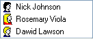
Default | Places the image to the left. If the RightToLeft property value is set to true, it places the image to the right.
|
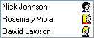
Far | Places the image to the right. If the RightToLeft property value is set to true, it places the image to the left.
|
Near | Places the image to the left. If the RightToLeft property value is set to true, it places the image to the right.
|

Note: the text is not displayed within the item if the GlyphAlignment property value is set to HorzAlignment.Center. In this case, the item displays the image only and this is controlled by the ImageListBoxItem.ImageIndex property. If no image is specified, the item displays nothing.