BaseButton.BorderStyle Property
Gets or sets the border style of the button control.
Namespace: DevExpress.XtraEditors
Assembly: DevExpress.XtraEditors.v19.1.dll
Declaration
Property Value
| Type | Description |
|---|---|
| BorderStyles | A BorderStyles enumeration member specifying the border style of the button. |
Available values:
| Name | Description |
|---|---|
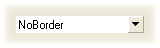
| NoBorder | There are no borders. The image below demonstrates the NoBorder style applied to the ButtonEdit control.
|
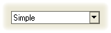
| Simple | Borders are flat. The image below demonstrates the Simple style applied to the ButtonEdit control.
|
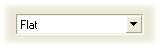
| Flat | Borders are flat. The image below demonstrates the Flat style applied to the ButtonEdit control.
|
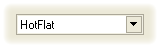
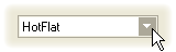
| HotFlat | Borders are flat. Borders and the client area are highlighted when the mouse pointer is positioned over them. The image below demonstrates the HotFlat style applied to the ButtonEdit control.
|
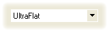
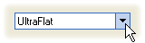
| UltraFlat | Borders have an Office XP style. Borders and the client area are highlighted when the mouse pointer is positioned over them or they are focused. Otherwise, there are no borders. The image below demonstrates the UltraFlat style applied to the ButtonEdit control.
|
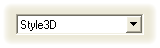
| Style3D | Borders are three-dimensional. The image below demonstrates the Style3D style applied to the ButtonEdit control.
|
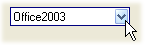
| Office2003 | Borders have an Office 2003 style. The image below demonstrates the Office2003 style applied to a ButtonEdit control.
|
| Default | The border style is determined by the current Look-and-Feel settings. For example, text editors’ borders are painted according to the RepositoryItem.LookAndFeel object’s settings. |
Remarks
The BorderStyle property overrides the base class property to hide it at design time. It is not recommended to use this property to change the button’s appearance. Instead, use the BaseButton.ButtonStyle property. Note that these properties are synchronized.