TabFormControlBase.ShowToolTips Property
Gets or sets whether to display hints for tab form pages.
Namespace: DevExpress.XtraBars
Assembly: DevExpress.XtraBars.v19.1.dll
Declaration
[DXCategory("ToolTip")]
[DefaultValue(DefaultBoolean.Default)]
public DefaultBoolean ShowToolTips { get; set; }Property Value
| Type | Default | Description |
|---|---|---|
| DefaultBoolean | **Default** | A DefaultBoolean enumeration value that specifies whether to display hints for tab form pages. |
Available values:
| Name | Description |
|---|---|
| True | Corresponds to a Boolean value of true. |
| False | Corresponds to a Boolean value of false. |
| Default | The value is determined by the current object’s parent object setting (e.g., a control setting). |
Remarks
If the ShowToolTips property is set to Default or False, hints are not displayed. Set this property to True to display hints for tab form pages. A hint is displayed when a tab is hovered over with the mouse pointer. See the figure below.
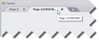
By default, hints contain page captions specified using the TabFormPage.Text property. This may be useful if a caption is not visible in its entirety within a tab, as in the figure above. However, you can specify a custom SuperToolTip for a tab form page using the TabFormPage.SuperTip property.
By default, tooltips are controlled by the default ToolTipController accessible using the DefaultToolTipController component. You can provide a custom controller for tab form page hints using the TabFormControlBase.ToolTipController property. See Tooltip Management for details.