PopupControlContainer Class
The control container that can be displayed as a dropdown.
Namespace: DevExpress.XtraBars
Assembly: DevExpress.XtraBars.v18.2.dll
Declaration
[ToolboxBitmap(typeof(ToolboxIconsRootNS), "PopupControlContainer")]
public class PopupControlContainer :
    PanelControl,
    PopupControl,
    IBarObject,
    ISupportLookAndFeel,
    IDXDropDownControlEx2,
    IDXDropDownControlEx,
IDXDropDownControlRelated API Members
The following members return PopupControlContainer objects:
Remarks
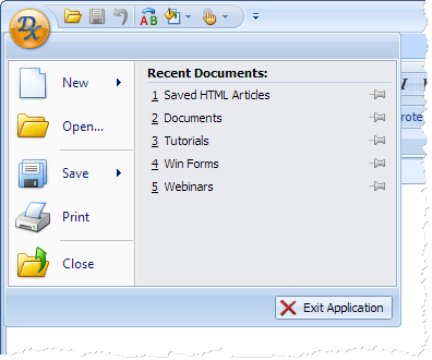
A PopupControlContainer object represents a panel that can contain any controls. This panel can be displayed as a dropdown for DropDownButton controls, bar buttons and the Ribbon Application Button.
A PopupControlContainer object can be created at design time by dragging the PopupControlContainer component from the Toolbox onto a form.
Note
For the PopupControlContainer object to work correctly, it must be bound to a BarManager or RibbonControl object using the PopupControlContainer.Manager or PopupControlContainer.Ribbon property, respectively.
After the panel has been created, you can add controls to it, and then bind the panel to a specific control using the following properties:
- for a DropDownButton control—use the DropDownButton.DropDownControl property;
- for a bar button—use the BarButtonItem.DropDownControl property. The BarButtonItem.ButtonStyle property must be set to BarButtonStyle.DropDown and the BarButtonItem.DropDownEnabled property must be set to true, to enable the dropdown functionality;
- for the Ribbon Application Button—use the RibbonControl.ApplicationButtonDropDownControl property.
Note
A PopupControlContainer is never displayed at runtime as a standalone panel. It can only be displayed as a dropdown.