TileBar Class
The bar with tiles that support the dropdown functionality.
Namespace: DevExpress.XtraBars.Navigation
Assembly: DevExpress.XtraBars.v18.2.dll
Declaration
Remarks
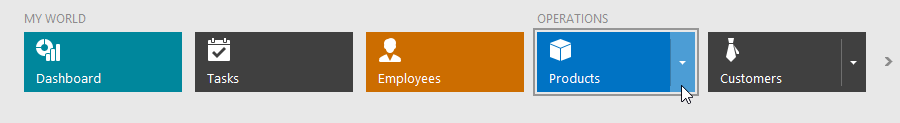
Use the TileBar control to implement a tile-based menu for your application. The TileBar consists of tiles (TileBarItem objects) arranged in a single row or column. Any tile can be associated with a dropdown control.
Pager Navigation
The RadioGroup and WindowsUIButtonPanel can be used as a pager for the following controls:
- TileControl
TileBar- NavigationFrame
- ImageSlider
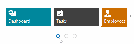
The pager automatically splits the target control’s content into pages, and provides navigation buttons to scroll to corresponding pages. The pager navigation functionality is implemented as a Behavior and can be added to your controls using the BehaviorManager component.
For more information, see Tile Bar