NavElement.AppearanceSelected Property
Provides access to the appearance settings used to paint the current button (NavElement) in the pressed state, when it resides within the nav bar. The specified background colors are also applied to the element’s primary dropdown tile bar (if present).
Namespace: DevExpress.XtraBars.Navigation
Assembly: DevExpress.XtraBars.v19.2.dll
Declaration
Property Value
| Type | Description |
|---|---|
| AppearanceObject | The appearance settings applied to the current NavElement rendered as a button in the nav bar, when the button is in the pressed state. |
Remarks
The appearance settings specified by the AppearanceSelected property are applied to:
- An item displayed in the nav bar, when the item is pressed.
- The background of this item’s primary dropdown tile bar.
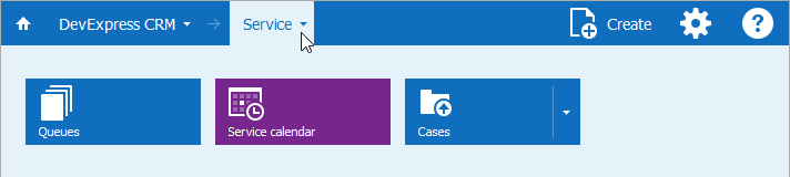
In the image below, the background of the pressed item and its primary dropdown tile bar are painted in the light cyan color.
To specify the default appearance settings for all pressed buttons in the nav bar, use the TileNavPane.AppearanceSelected property. The NavElement.AppearanceSelected property affects the appearance of the current item, overriding the default appearance settings (TileNavPane.AppearanceSelected).
Appearance of Items Rendered as Tiles
- NavElement.Tile.AppearanceItem - Specifies the appearance of a specific NavElement rendered as a tile.
- TileNavPane.OptionsPrimaryDropDown.AppearanceItem - Specifies the default appearance settings for all tiles displayed in primary dropdowns.
- TileNavPane.OptionsSecondaryDropDown.AppearanceItem - Specifies the default appearance settings for all tiles displayed in secondary dropdowns.
- TileNavElement.OptionsDropDown.AppearanceItem - Specifies the appearance of an element’s children displayed as tiles in a dropdown tile bar.