WidgetView.LayoutMode Property
Gets or sets the current layout mode for this WidgetView.
Namespace: DevExpress.XtraBars.Docking2010.Views.Widget
Assembly: DevExpress.XtraBars.v23.2.dll
NuGet Package: DevExpress.Win.Navigation
Declaration
[DefaultValue(LayoutMode.StackLayout)]
[XtraSerializableProperty]
public LayoutMode LayoutMode { get; set; }Property Value
| Type | Default | Description |
|---|---|---|
| LayoutMode | StackLayout | A LayoutMode enumerator value that specifies the current layout mode for this WidgetView. |
Available values:
| Name | Description |
|---|---|
| StackLayout | The WidgetView is in Stack Layout Mode. |
| TableLayout | The WidgetView is in Table Layout Mode. |
| FlowLayout | The WidgetView is in Flow Layout Mode. |
| FreeLayout | The Widget View is in Free Layout Mode. |
Remarks
The LayoutMode property allows you to choose a layout mode for the current WidgetView.
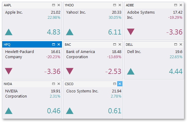
In LayoutMode.StackLayout mode, the View’s layout is built by StackGroup objects. These groups can be either vertical or horizontal, depending on the WidgetView.Orientation property. For each Stack Group, you can set either the absolute length in pixels, or a star-measured relative length that specifies how much wider or narrower this group is compared to other groups. The figure below illustrates a sample WidgetView with the Stack Layout mode applied.
In LayoutMode.TableLayout mode, the View’s WidgetView.Orientation property is ignored and the layout is formed by row and column sets. These rows and columns, represented by the RowDefinition and ColumnDefinition objects, are stored in the zero-based indexed WidgetView.Rows and WidgetView.Columns collections respectively. To place a Document into the specific table cell, use the Document.RowIndex and Document.ColumnIndex properties to set the indexes of the required row and column. Each Document can also stretch vertically and/or horizontally over multiple neighboring cells, depending on its Document.RowSpan and Document.ColumnSpan property values. The following figure demonstrates a Table Layout WidgetView.

In LayoutMode.FlowLayout mode, widgets follow each other according to the specific flow direction (see the FlowLayoutProperties.FlowDirection property). This mode supports content wrap that specifies whether a widget should start a new column (row) if the previous widget has reached the View border. To tweak this layout mode, use properties stored within the WidgetView.FlowLayoutProperties section. The figure below illustrates a Flow Layout, applied to the WidgetView.

- The Free Layout Mode imposes no restrictions on how to organize your widgets and allows you to build any desired layout. Also, this is the only layout mode that fully supports floating widgets.
See the Widget View topic for the details.