DockPanel Class
Represents a dock panel.
Namespace: DevExpress.XtraBars.Docking
Assembly: DevExpress.XtraBars.v19.2.dll
Declaration
[ProhibitUsingAsDockingContainer]
public class DockPanel :
    ZIndexControl,
    IToolTipControlClient,
    IFlickGestureClient,
    IButtonsPanelOwner,
    IButtonsPanelGlyphSkinningOwner,
    IDockPanelInfo,
    ISupportLookAndFeel,
    ILookAndFeelProvider,
    IDXMenuManagerProvider,
    IGestureClient,
    IContextMenuOwner,
    ILogicalContainer,
    ILogicalOwner,
    ISupportAppearanceObjectPropertiesFilter,
ISupportDXSkinColorsRelated API Members
The following members return DockPanel objects:
Remarks
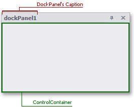
Dock panels are the basis of docking functionality for applications. A dock panel provides the client area to which visual elements can be added.
Dock panels are managed by a DockManager component. You need to place a dock manager on a container control (form or user control) to provide docking functionality for this control. The DockManager.Form property must refer to the container control. Otherwise, no panels can be created.
Dock panels can float, can be docked to other dock panels and to the container control which the DockManager.Form property refers to.
To create dock panels and dock them to the DockManager.Form or float them, use the DockManager.AddPanel method. To create panels and dock them to other panels, the DockPanel.AddPanel, DockPanel.DockTo and DockPanel.DockAsTab methods can be used.
Panels can be docked to each other using drag and drop operations. In this case, a tab container or split container is created, depending upon the position at which the panel is released within the target panel. Tab and split containers are also represented by DockPanel instances. However these, unlike regular panels, cannot display visual controls. Note that a container is automatically destroyed when it has only two panels and one of these panels is undocked from the container. A container that owns a specific panel can be accessed via this panel’s DockPanel.ParentPanel property. Tab and split containers can also be created in code (using the DockPanel.AddPanel, DockPanel.DockAsTab and DockPanel.DockTo methods). See the Docking Panels Programmatically topic for more information.
If a panel isn’t a tab or split container, it can display visual controls. To add visual elements to the panel, add them directly to the panel’s DockPanel.ControlContainer. This control represents the panel’s client area. It provides the Controls property which is the collection of visual elements displayed by the panel.
For more information on dock panels, see the Dock Panels document.
Example
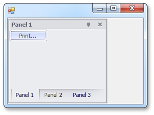
In the following example three panels are created and docked to form a split container. Then the DockPanel.Tabbed property of the split container is set to true and this transforms the split container into a tab container. The result is shown below:
using DevExpress.XtraBars.Docking;
// ...
// Create a panel and dock it to the left edge of the form.
DockPanel p1 = dockManager1.AddPanel(DockingStyle.Left);
p1.Text = "Panel 1";
// Add a button to the panel.
DevExpress.XtraEditors.SimpleButton btn = new DevExpress.XtraEditors.SimpleButton();
btn.Text = "Print...";
p1.ControlContainer.Controls.Add(btn);

// Add a new panel to the first panel. This forms a split container.
DockPanel p2 = p1.AddPanel();
p2.Text = "Panel 2";

// Add a new panel to the split container.
DockPanel p3 = p1.ParentPanel.AddPanel();
p3.Text = "Panel 3";
// ...

// Transform the split container into a tab container.
p1.ParentPanel.Tabbed = true;
Related GitHub Examples
The following code snippet (auto-collected from DevExpress Examples) contains a reference to the DockPanel class.
Note
The algorithm used to collect these code examples remains a work in progress. Accordingly, the links and snippets below may produce inaccurate results. If you encounter an issue with code examples below, please use the feedback form on this page to report the issue.