BarItem.PaintStyle Property
Specifies the style with which to display a specific BarItem within a bar.
Namespace: DevExpress.XtraBars
Assembly: DevExpress.XtraBars.v19.2.dll
Declaration
[DXCategory("Appearance")]
[SupportedByRibbon(SupportedByRibbonKind.SupportedInMenu)]
public virtual BarItemPaintStyle PaintStyle { get; set; }Property Value
| Type | Description |
|---|---|
| BarItemPaintStyle | A BarItemPaintStyle enumerator value specifying the item style. |
Available values:
| Name | Description |
|---|---|
| Standard | Specifies that a specific item is represented using its default settings.
|
| Caption | Specifies that a specific item is represented by its caption only.
|
| CaptionInMenu | Specifies that a specific item is represented by its caption when it is in a submenu, or by its image when it is in a bar.
|
| CaptionGlyph | Specifies that a specific item is represented both by its caption and the glyph image.
|


Remarks
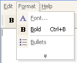
The PaintStyle property defines the look & feel of the current item. For instance, if a specific BarButtonItem has an associated icon and hotkey combination, but the PaintStyle property value is set to BarItemPaintStyle.CaptionInMenu, then the hotkey combination is disabled.
Note
Different bar items behave differently when their PaintStyle property is set to Standard. For instance, by default ,BarButtonItems display only their images, while BarSubItems display only captions. To display a glyph instead of a caption for a BarSubItem, set this item’s PaintStyle property to CaptionInMenu.