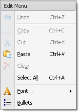
BarHeaderItem Class
Displays static text using a heading style which is determined by the current skin. The text is typically painted bold against a background that is different from the background of regular buttons. Use BarHeaderItem to add headers to a PopupMenu or BarSubItem (sub-menu) to separate sets of items.
Namespace: DevExpress.XtraBars
Assembly: DevExpress.XtraBars.v23.2.dll
NuGet Package: DevExpress.Win.Navigation
Declaration
public class BarHeaderItem :
    BarStaticItem,
    IOptionsMultiColumnOwner,
IMultiColumnInfoProviderRelated API Members
The following members return BarHeaderItem objects:
Remarks
BarHeaderItem is a bar item that can be added to a PopupMenu or BarSubItem (sub-menu) to give a caption to a set of items that follow this BarHeaderItem.
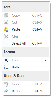
The items that follow the BarHeaderItem in the PopupMenu/BarSubItem are arranged in one column by default. You can arrange them in multiple columns by setting the BarHeaderItem.MultiColumn property to True. Multi-column mode settings (including the number of columns and item text visibility) can be customized using the BarHeaderItem.OptionsMultiColumn property.
To enable multi-column mode for all items in the PopupMenu and BarSubItem, use the PopupMenu.MultiColumn and BarLinkContainerItem.MultiColumn inherited property, respectively. If the BarHeaderItem.MultiColumn property is set to Default, the multi-column mode availability is specified by the MultiColumn property of the item’s owner menu. It is possible to customize multi-column mode settings in a centralized way, using these properties:
- PopupMenu.OptionsMultiColumn - Specifies multi-column mode settings for all items in the PopupMenu.
- BarLinkContainerItem.OptionsMultiColumn - Specifies multi-column mode settings for all items in the sub-menu.
- BarManagerProperties.OptionsMultiColumn (accessible using the BarAndDockingController.PropertiesBar property) - Specifies multi-column mode settings for all popup menus and sub-menus.
See Bar Item Links to learn more.
Tip
If you only need to display a caption at the top of the PopupMenu, use the PopupMenu.MenuCaption and PopupMenu.ShowCaption properties.