BarCheckItem.CheckStyle Property
Gets or sets the check box style.
Namespace: DevExpress.XtraBars
Assembly: DevExpress.XtraBars.v19.1.dll
Declaration
[DefaultValue(BarCheckStyles.Standard)]
[SmartTagProperty("Check Box Style", "Appearance", 1)]
[DXCategory("Appearance")]
public BarCheckStyles CheckStyle { get; set; }Property Value
| Type | Default | Description |
|---|---|---|
| DevExpress.XtraBars.BarCheckStyles | **Standard** | A BarCheckStyles enumerator value that specifies the check box style. |
Remarks
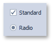
If the BarCheckItem‘s check box is visible (see the BarCheckItem.CheckBoxVisibility property), you can use the CheckStyle property to specify whether this check box should look like a regular check box or radio button. The figure below illustrates the difference.
Radio boxes can be shown for check items united in a single radio group by the BarBaseButtonItem.GroupIndex property.
See Also